Row & Column
Row and Column are directional auto-layout containers. A Row arranges children left-to-right; a Column arranges them top-to-bottom. They’re the most common layouts you’ll use.
The mental model
Each container has a main axis and a cross axis:
| Container | Main axis | Cross axis |
|---|---|---|
| Row | Horizontal | Vertical |
| Column | Vertical | Horizontal |
Children flow along the main axis with Gap between them, then position on the cross axis according to CrossAlign. Extra main-axis space is distributed by the Gap unit (SpaceBetween / SpaceAround / SpaceEvenly).
Basic Row
Basic Column
Alignment
MainAlign and CrossAlign set how the whole content block sits within the container.
| Property | Values | Effect |
|---|---|---|
MainAlign | Start · Center · End | Position of the children block along the main axis |
CrossAlign | Start · Center · End · Stretch | Position along the cross axis; Stretch grows children to fill the cross axis |
Alignment
MainAlign and CrossAlign set how the whole content block sits within the container. Center() is shorthand for .MainAlign(Center).CrossAlign(Center).
Main-axis distribution
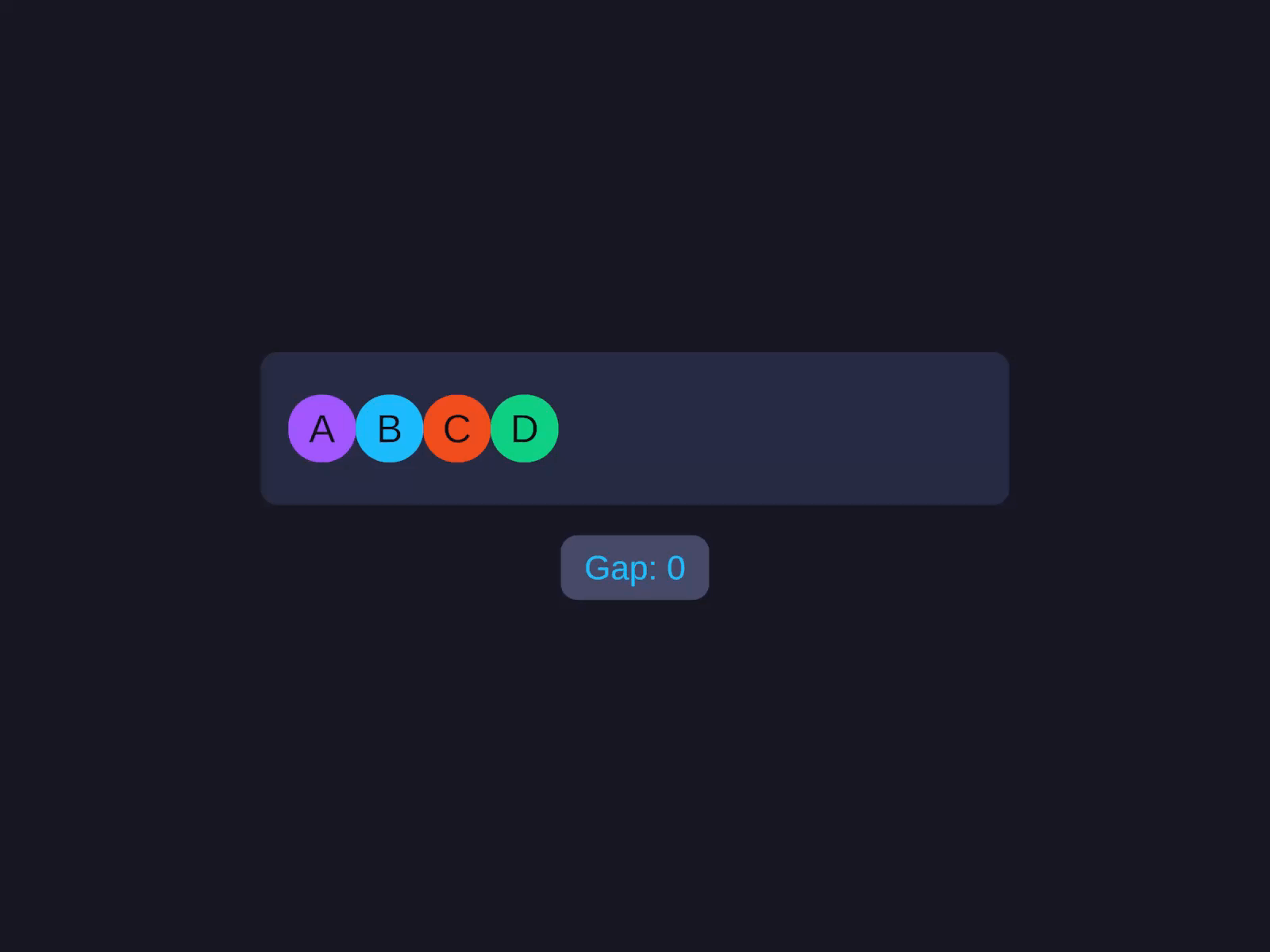
When children don’t fill the main axis, distribution decides how the leftover space is spread between them. There’s no separate field — it lives in the Gap unit (or the builder’s SpaceBetween() / SpaceAround() / SpaceEvenly()).
| Gap unit | Builder / value | Effect | Picture |
|---|---|---|---|
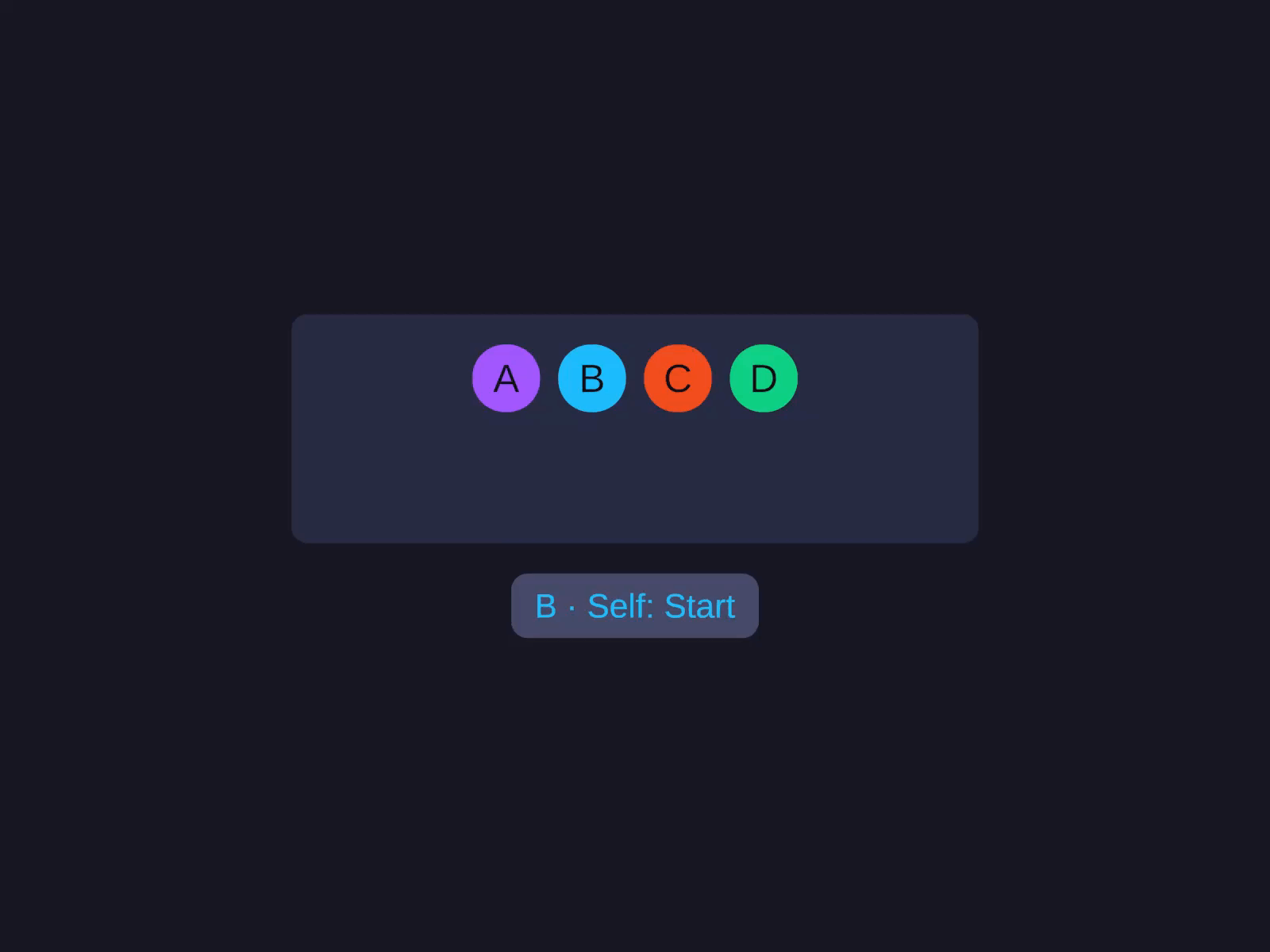
px (default) | .Gap(n) | Children packed, gap = the literal value | [A][B][C]_____ |
auto | UIGap.SpaceBetween | Equal gaps between children, none at edges | [A]___[B]___[C] |
around | UIGap.SpaceAround | Equal gaps, half-gaps at the edges | _[A]__[B]__[C]_ |
even | UIGap.SpaceEvenly | Equal gaps everywhere, including the edges | __[A]__[B]__[C]__ |
The Gap demo below steps through fixed pixel gaps and all three distribution modes in one clip.
When the Gap unit is a distribution mode (anything other than pixels/percent), MainAlign is effectively ignored — distribution decides where children sit.
Wrap
Set .Wrap() on a Row or Column to let children flow onto new lines when they overflow the main axis.
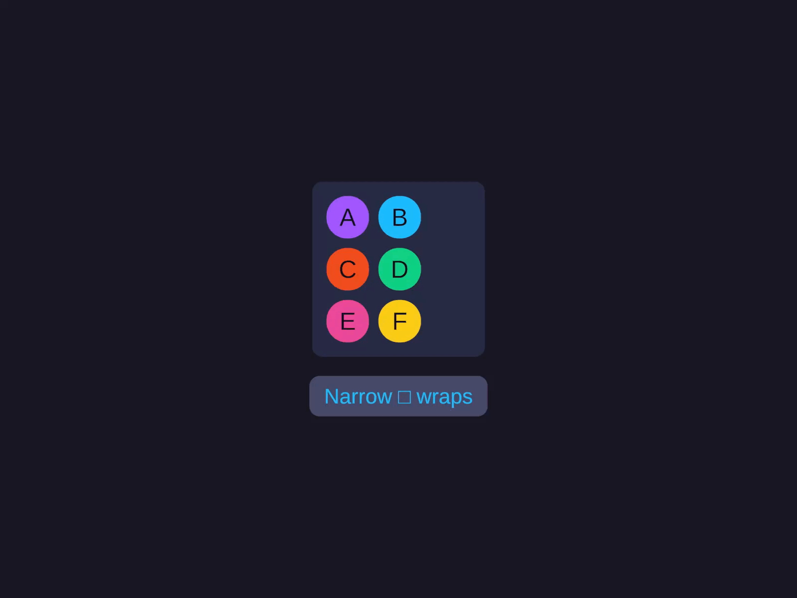
A wrapped Column flows children top-to-bottom, then wraps into new columns. (Less common but supported.)
Reverse children
Flip the visual order of children without changing alignment semantics. Row + ReverseChildren = right-to-left iteration; Alignment.Start still means “the start of the main axis” (the left edge).
Orthogonal to Direction — the two can be combined.
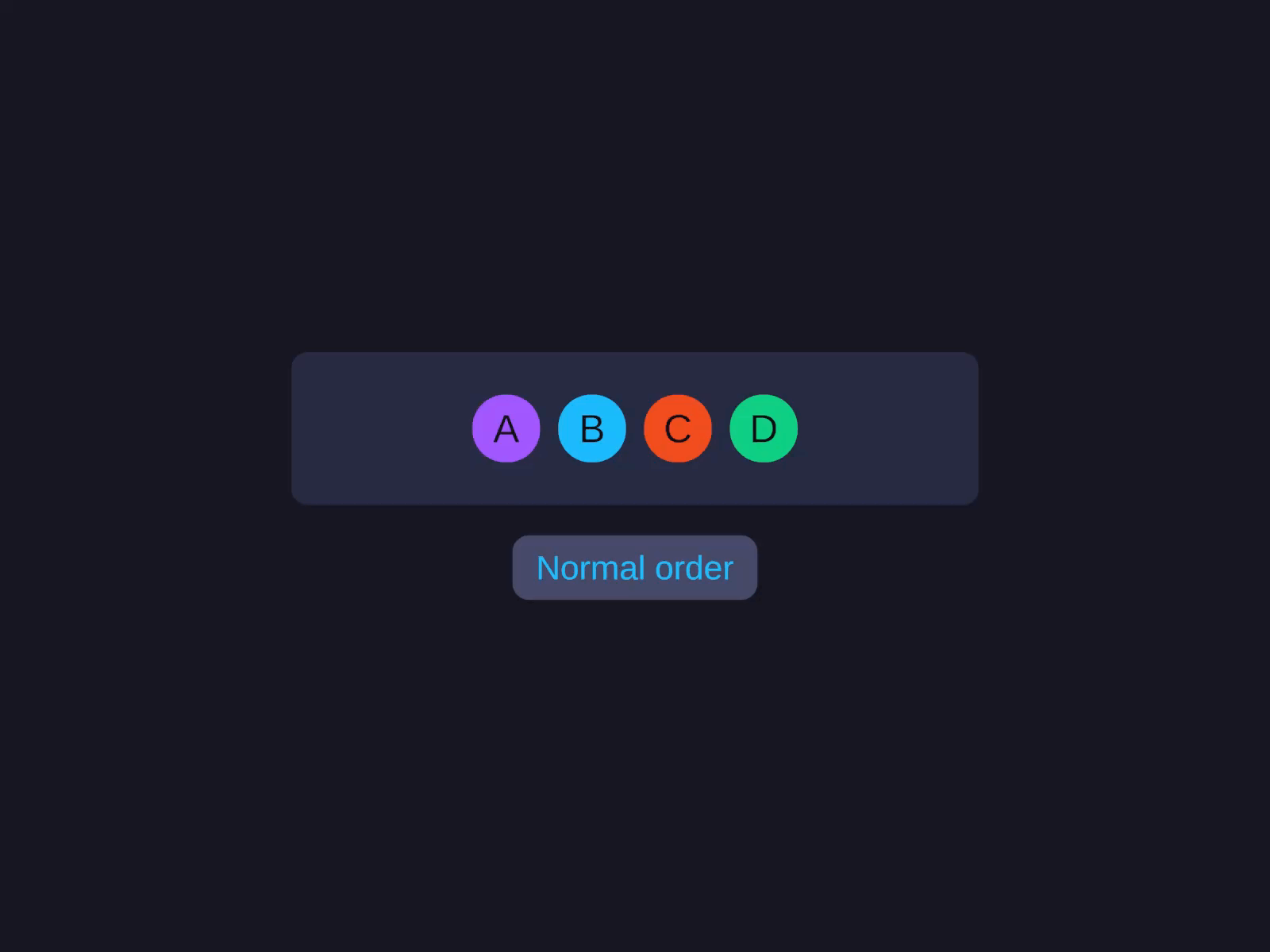
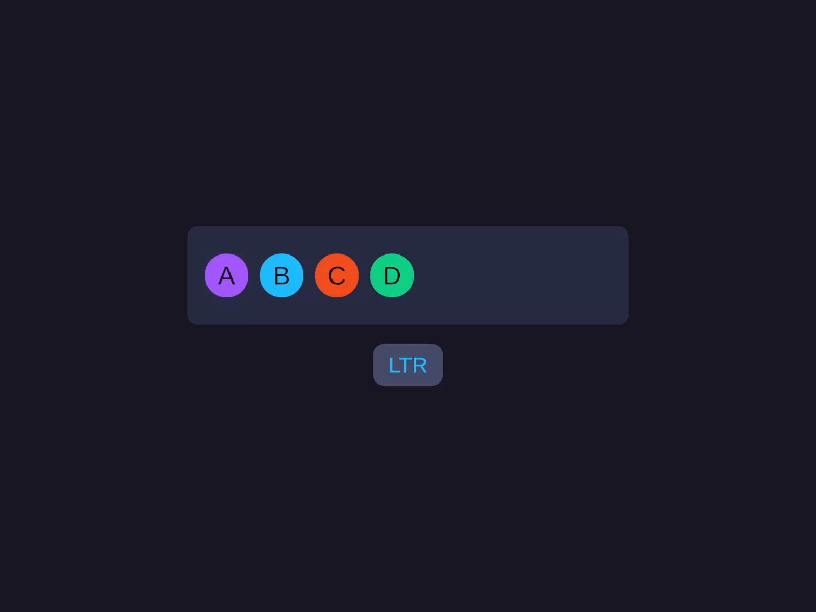
Direction
Direction(LayoutDirection.RightToLeft) (or shorthand .RTL()) flips Row/Wrap visually right-to-left, AND remaps Alignment.Start to the right edge. This is the correct way to support Arabic/Hebrew layouts. Inherits down the tree.
Direction / RTL
Direction(LayoutDirection.RightToLeft) (shorthand .RTL()) flips Row/Wrap visually right-to-left and remaps Alignment.Start to the right edge — the correct way to support Arabic/Hebrew layouts. Inherits down the tree.
Values: Inherit (default — uses parent’s direction) · LeftToRight · RightToLeft. Has no effect on Column.
Gap
The space between adjacent children. Has no effect on Grid — use Grid → Column Gap and Row Gap instead.
Gap & distribution
The Gap field, both ways: a fixed pixel gap growing (0, 40, 120), then the distribution modes (Space-between / Space-around / Space-evenly) that spread children using free space. Percentage variant .GapPercent(2) is 2% of the parent's main-axis size.
Percentage variant: .GapPercent(2) is “2% of parent’s main-axis size.”
The Gap inspector field accepts unit suffixes, math, and auto/even distribution shorthands — type auto for SpaceBetween, around for SpaceAround, even for SpaceEvenly. See Inspector Input.
Wrap Gap
The cross-axis spacing between wrap lines. Only appears in the inspector when Wrap is enabled. Gap sets the spacing between cards on a line; Wrap Gap sets the spacing between the wrapped lines.
WrapGap(-1) (the default) means “use the same value as Gap.”
Linear item
Cross-axis alignment for a single child can override the parent’s CrossAlign — set on the child, not the Row/Column container.
CrossAxisSelfAlign takes a CrossAxisItemAlign:
| Value | Effect |
|---|---|
Inherit (default) | Use the parent’s CrossAlign |
Start | Pin to the cross-axis start (top in Row, left in Column) |
Center | Center on the cross axis |
End | Pin to the cross-axis end |
There is intentionally no Stretch value — to stretch a single child across the parent’s cross axis, set its cross-axis size to Fill or Percentage instead.
Common patterns
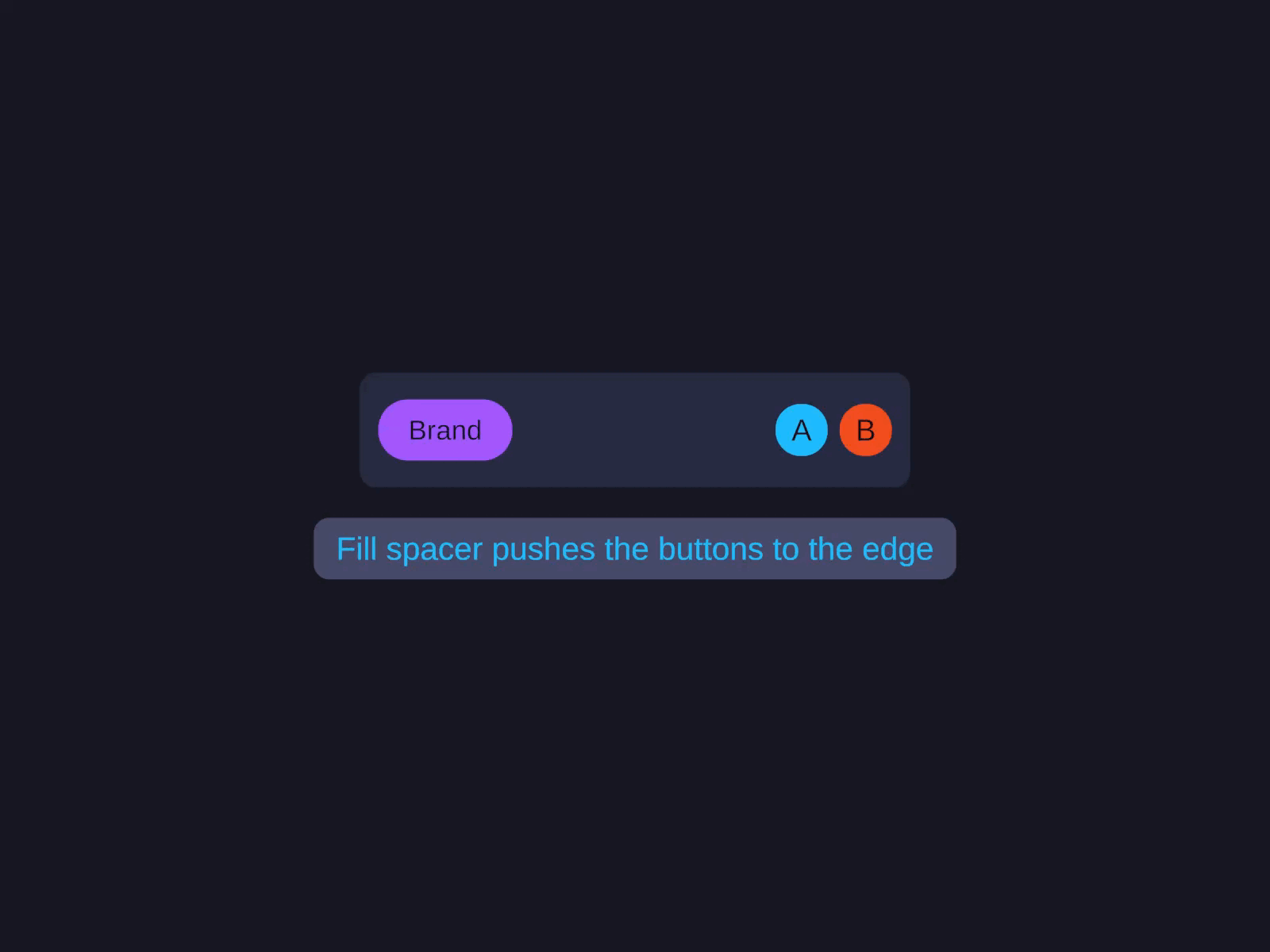
Toolbar (left + right)
A Row container with Width Fill, holding the brand element, then a Fill-width spacer child that pushes the trailing buttons to the right edge. See the Code API for the builder version.
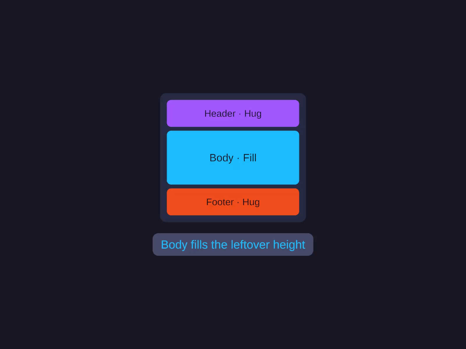
Page shell (header / body / footer)
A Column container filling both axes, with a Hug-height header, a Fill-height body that absorbs the extra vertical space, and a Hug-height footer. See the Code API for the builder version.
Card grid (wrapped row of cards)
A Row container with Width Fill and Wrap enabled, holding fixed-width Hug-height card children that flow onto new lines as they overflow. See the Code API for the builder version.
For dense, performant grids of many items, prefer the GridView virtualised component.