Carousel
There are two ways to build a carousel, depending on how many slides you have:
- Static (scene-built) — for a small, fixed set (onboarding, a few featured cards): a horizontal
AutoLayoutScrollViewwith snap turned on, and your slides added as plain children. No prefab, no code, no binding. - Virtualized (
CarouselView) — for larger or data-driven sets: theCarouselViewcomponent pools and recycles slides from a prefab, and adds Slide / Loop / Fade modes, multi-item pages, and effects.
Static carousel (scene-built)
Drop an AutoLayoutScrollView (Row content) on a container, enable Snap to items, and add your slide
cards as children. It snaps to each slide as you swipe — no CarouselView, no binding required.
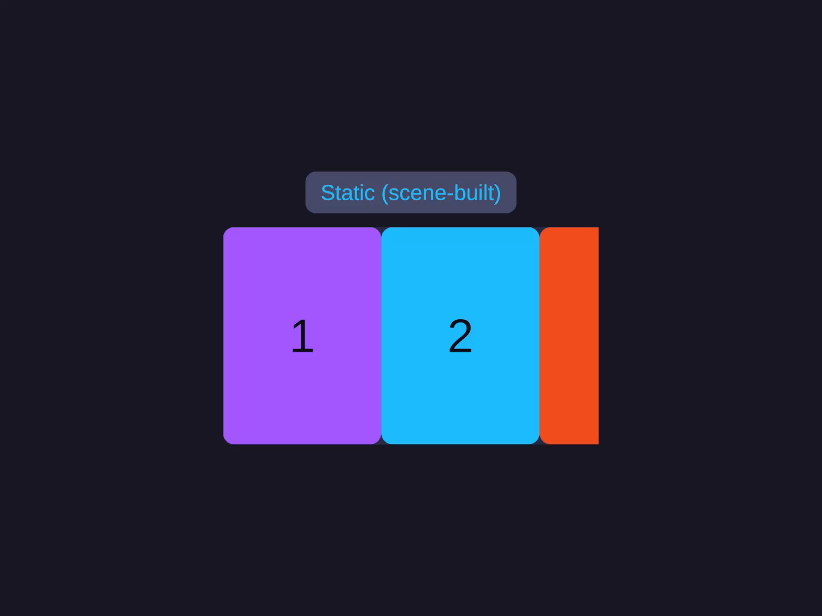
Static (scene-built)
A horizontal AutoLayoutScrollView with Snap to items on, and slides added as plain children — no prefab or binding. Best for a small, fixed set.
Add an AutoLayoutScrollView with Content Mode = Row, enable Snap to items, then parent your
slide cards under it.
var scroll = go.GetComponent<AutoLayoutScrollView>();scroll.ContentMode = ScrollContentMode.Row;scroll.SnapToItems = true;// ...then add your slide GameObjects as children of the scroll content.Virtualized carousel — modes & features
The CarouselView component is the data-driven path: register a prefab + item count and it pools slides,
with Slide / Loop / Fade modes and multi-item pages.
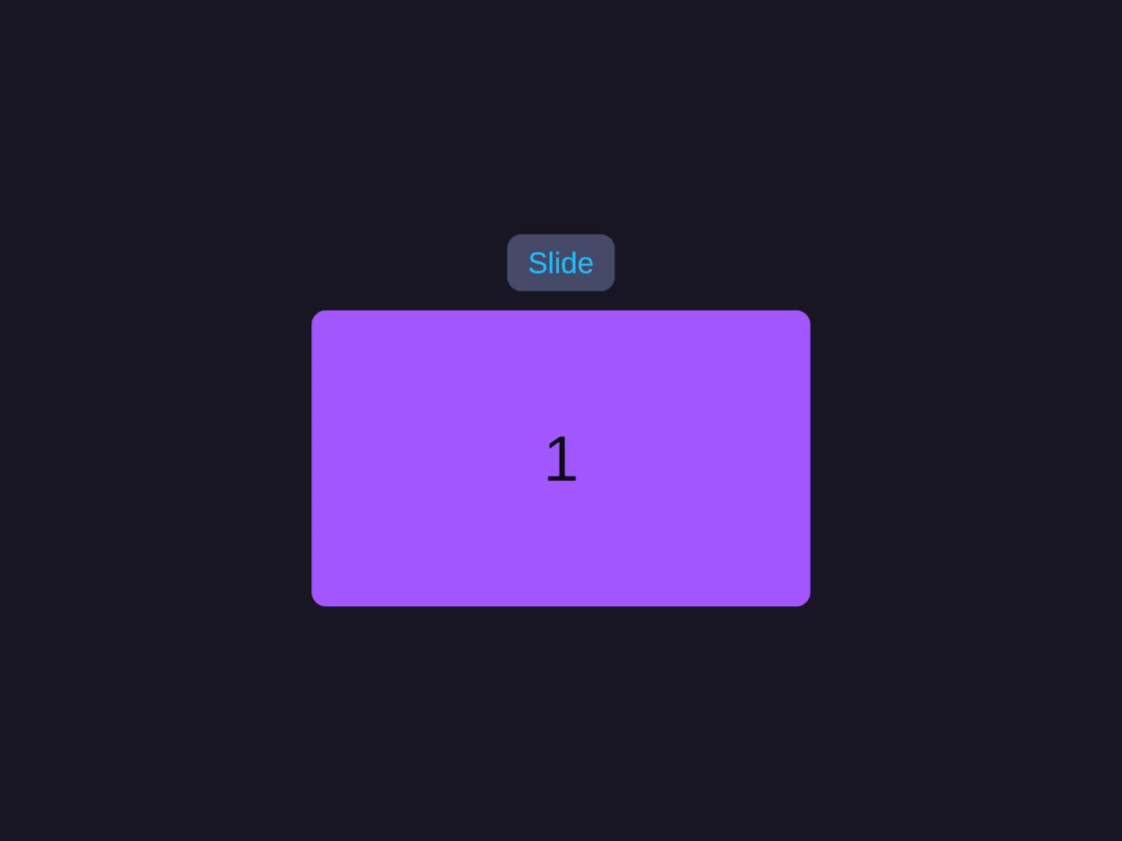
Slide mode
The default Slide type scrolls within bounds and clamps at the first and last item. Set Type = CarouselType.Slide for a classic snap-to-item carousel.
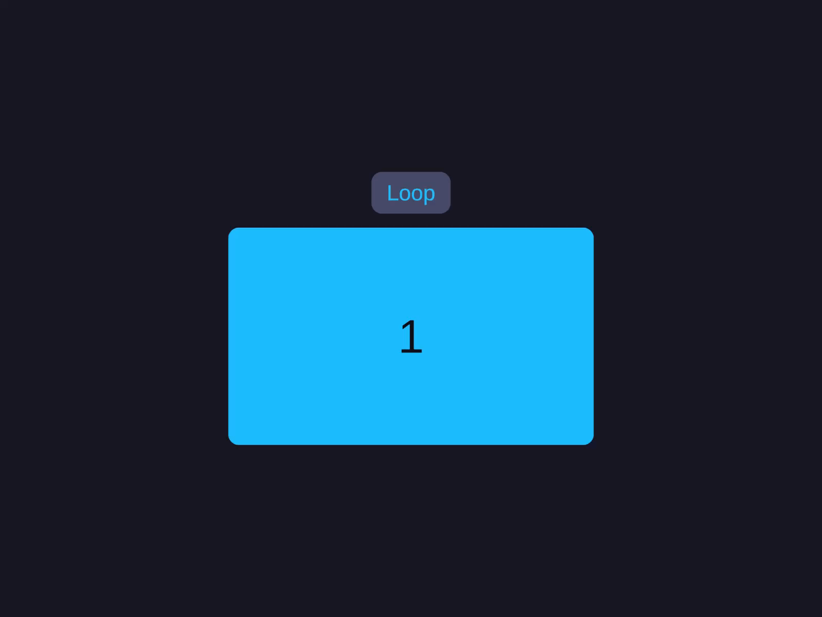
Loop mode (wrap around)
Type = CarouselType.Loop enables infinite wrap-around scrolling — GoToNext() past the last item snaps back to the first.
Fade mode (cross-fade)
Type = CarouselType.Fade stacks the items at the centre and cross-fades them by opacity — one visible at a time, 1 at the focused item fading to 0 at the neighbours — instead of sliding them. (For custom motion you can also add an ICarouselEffect, which receives each item’s normalized distance from centre.)
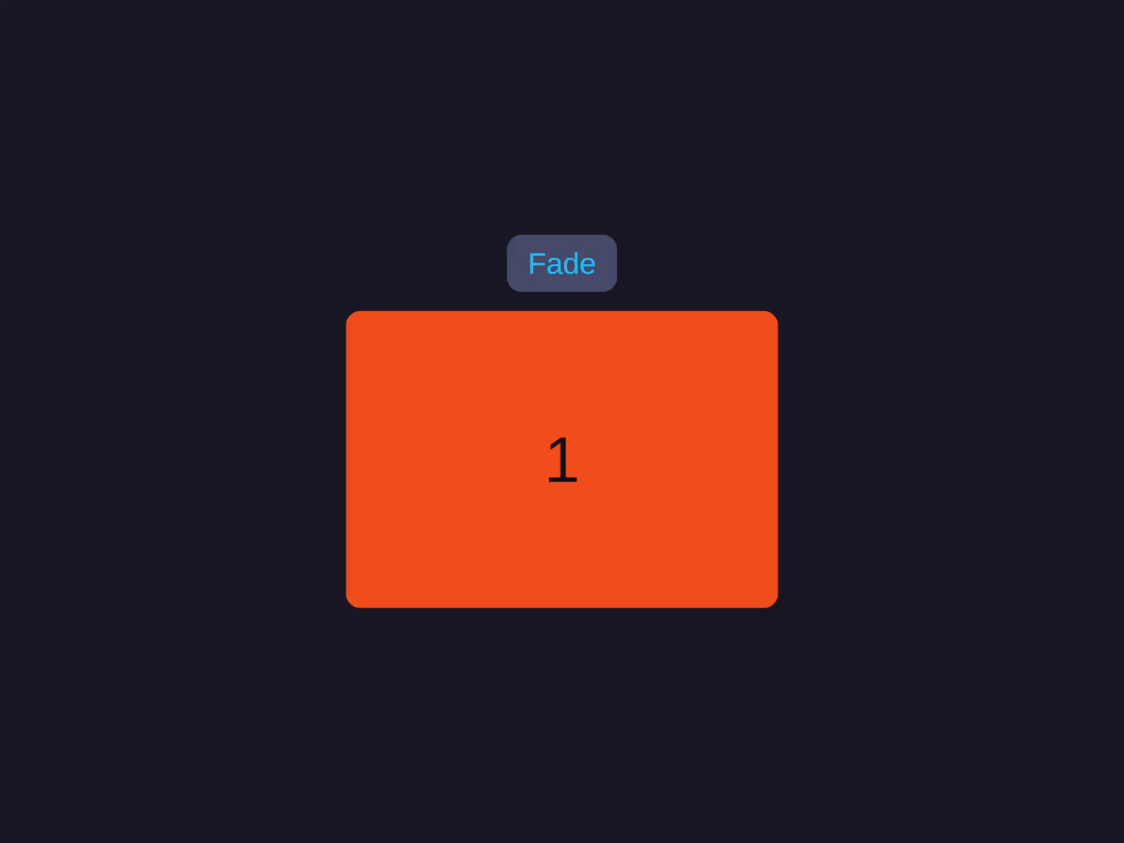
Fade mode (cross-fade)
Type = Fade stacks items at the centre and cross-fades by opacity — one item visible at a time — instead of translating them.
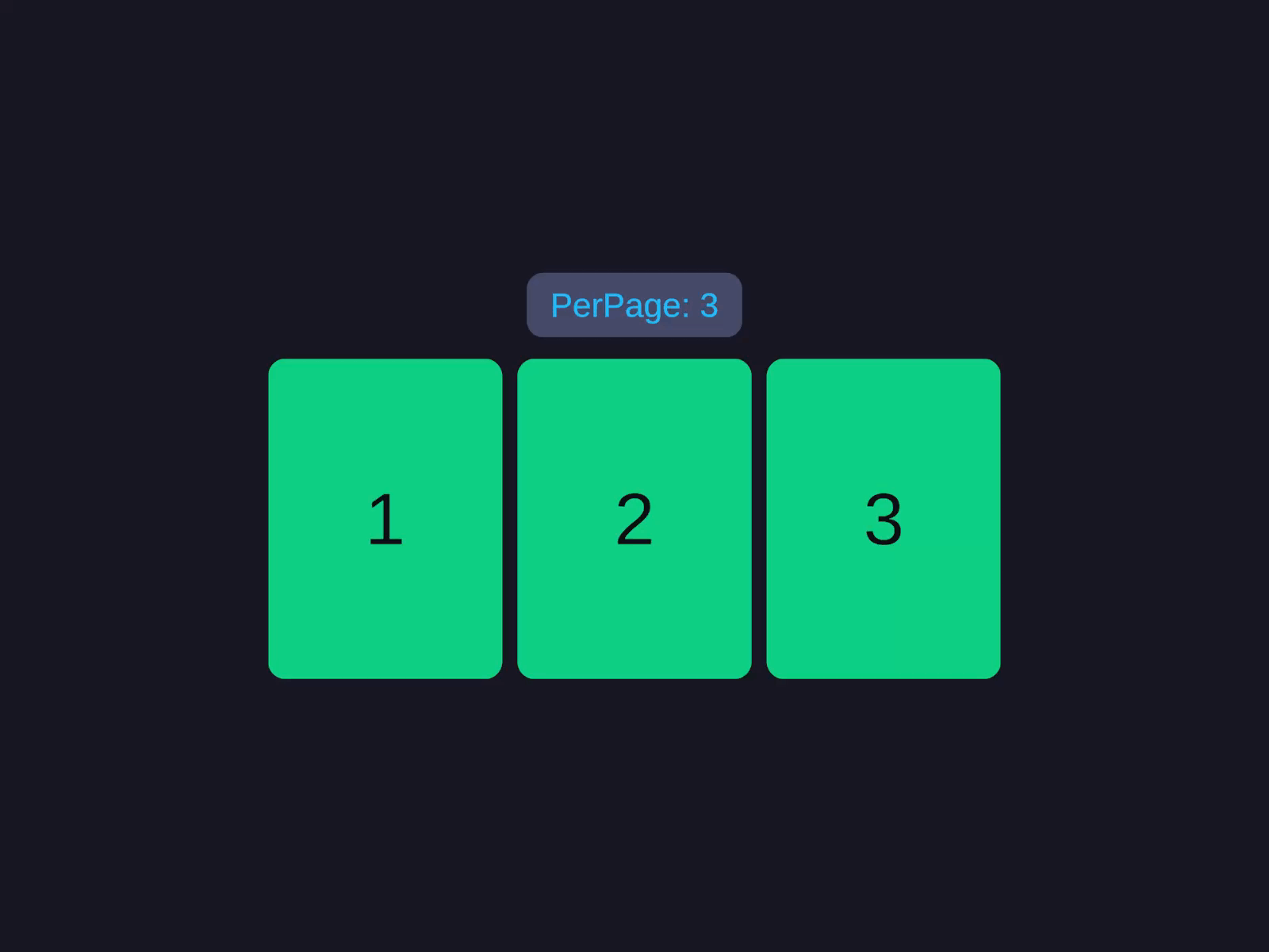
Multi-item (PerPage > 1)
Set PerPage greater than 1 to show several slides in the viewport at once; item size is auto-calculated from viewport, padding, and gap.
Inspector Setup
- Create a container with
AutoLayoutandAutoLayoutScrollView. - Add the CarouselView component.
- Register a prefab in the Prefabs list and set
ItemCount+ a bind callback via code (the component pools slides from the prefab — it does not lay out arbitrary scene children; for that, use the static scene-built carousel above). - Toggle Virtualized off for immediate (non-pooled) instantiation while keeping the same prefab + bind.
| Field | Type | Default | Description |
|---|---|---|---|
| Direction | CarouselDirection | Horizontal | Scroll axis |
| Type | CarouselType | Slide | Slide, Loop, or Fade |
| Per Page | int | 1 | Visible slides at once |
| Focus | FocusMode | Center | Snap alignment (Start, Center, End) |
| Padding | float | 0 | Edge padding in pixels |
| Gap | float | 0 | Gap between items |
| Speed | float | 400 | Transition/snap duration in ms (or set DurationSeconds in seconds) |
| Is Rewind | bool | false | Wrap from last to first |
| Uniform Item Size | float | 0 | Fixed item size (0 = auto) |
| Virtualized | bool | true | Enable object pooling (only effective when prefabs are registered) |
| Overscan Count | int | 2 | Extra items rendered offscreen |
| Default Pool Capacity | int | 10 | Initial pool size per prefab type |
| Prefabs | List | - | Prefab registrations (typeId + prefab + capacity) |
Code Usage
Build it in the Inspector (see Inspector Setup above), or from code with the Code API.
Methods
| Method | Description |
|---|---|
GoToItem(int index, bool animated = true) | Navigate to specific item |
GoToNext(bool animated = true) | Navigate forward |
GoToPrevious(bool animated = true) | Navigate backward |
AddEffect(ICarouselEffect effect) | Add visual scroll effect |
RemoveEffect(ICarouselEffect effect) | Remove visual effect |
RefreshItems() | Refresh after data change (virtualized only) |
RefreshItemsImmediate() | Synchronous refresh (virtualized only) |
Properties
| Property | Type | Description |
|---|---|---|
FocusedIndex | int | Currently focused item index |
IsSnapping | bool | Snap animation in progress |
IsDragging | bool | User is dragging |
ItemCount | int | Total number of items |
ScrollProgress | float | Continuous scroll progress |
Events (CarouselView component)
Subscribe via Capture after building:
| Event | Signature | Description |
|---|---|---|
OnFocusChanged | Action<int> | Fires when focused item changes |
OnFocusChanging | Action<int, int> | Fires during transition (from, to) |
OnScrollProgress | Action<float> | Continuous scroll progress updates |
Callbacks (virtualized mode)
| Callback | Signature | Description |
|---|---|---|
GetItemCallback | Func<int, object> | Return data for index |
GetItemTypeCallback | Func<int, int> | Return prefab type for index |
BindItemCallback | Action<GameObject, int, object> | Bind data to item |
UnbindItemCallback | Action<GameObject, int> | Cleanup on recycle |
Builder API
| Method | Description |
|---|---|
.Type(CarouselType) | Slide, Loop, or Fade |
.Focus(FocusMode) | Start, Center, End |
.PerPage(int) | Visible slides at once |
.Gap(float) | Gap between items |
.Padding(float) | Edge padding |
.Duration(float) | Transition/snap duration in seconds (preferred) |
.Speed(float) | Same, in milliseconds (legacy) |
.Rewind(bool) | Wrap from last to first |
.Easing(CarouselEasingFunction) | Custom easing |
.PoolCapacity(int) | Default pool size per prefab |
.Prefab(GameObject, int) | Register type-0 prefab |
.Prefab(int, GameObject, int) | Register typed prefab |
.Effect(ICarouselEffect) | Add visual effect |
.Delegate(ICarouselViewDelegate) | Set delegate (overrides callbacks) |
.ItemCount(int) | Set total items |
.GetItem(Func<int, object>) | Set data callback |
.BindItem(Action<GameObject, int, object>) | Set bind callback |
.UnbindItem(Action<GameObject, int>) | Set unbind callback |
.Capture(Action<CarouselView>) | Capture reference (e.g. .Capture(view => m_Carousel = view)) |
Interfaces
ICarouselItem— Implement on prefab root for auto-binding.ICarouselViewDelegate— Full data source control (overrides callbacks).ICarouselEffect— Custom visual effects applied during scroll.
Notes
.Carousel(direction, configure)configures the parent in place and returns the parentLayoutBuilder— keep chaining or call.Build()to materialise the tree.- Use
Focus = Centerfor typical snap-to-center carousels;Startsnaps the leading edge;Endsnaps the trailing edge. .Type(CarouselType.Loop)enables wrap-around scrolling;Slideclamps at boundaries;Fadestacks and cross-fades items by opacity.