Grid
Grid layout arranges children in 2D rows and columns, much like CSS Grid. Use it when content is naturally tabular or when you need a card grid with consistent cell sizes.
Note: this is the layout engine’s Grid. For a virtualised, scrollable grid of many items (like a long photo gallery), use the GridView component instead.
Quick start
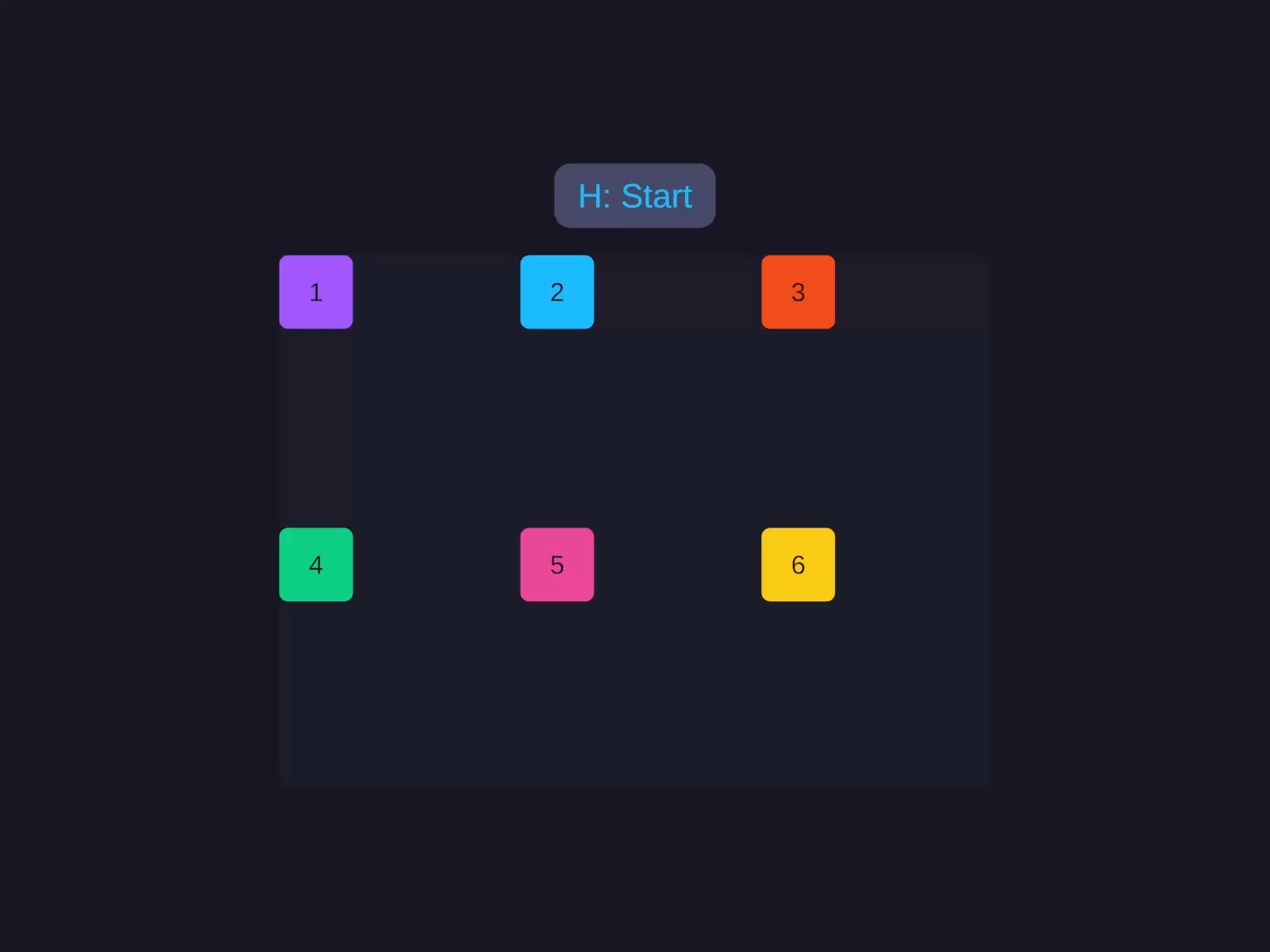
A real CSS Grid
Template tracks, repeat(), spans, dense packing, and auto-flow — not Unity's GridLayoutGroup. Items flow left-to-right, top-to-bottom; the fourth starts a new row.
Three columns with 8px gap. Items flow left-to-right, top-to-bottom; the fourth item starts a new row.
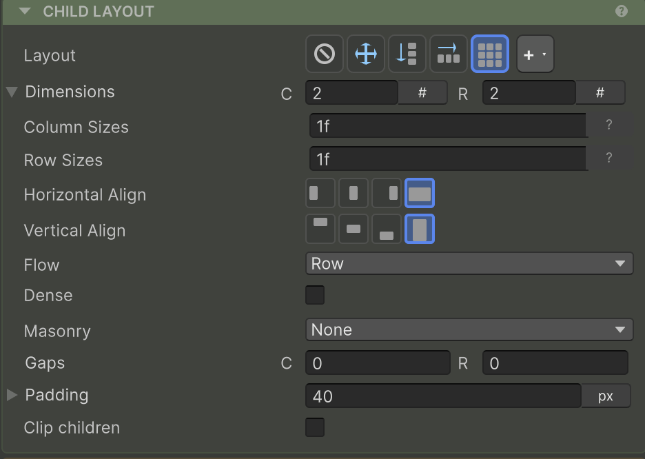
Dimensions
Track count fields. 0 (or auto in the inspector) means “as many as needed.”
| Property | Builder | Notes |
|---|---|---|
| Columns | .GridColumns(n) | 0 = auto (one column) |
| Rows | .GridRows(n) | 0 = auto (rows expand to fit) |
If you only set GridColumns(3) and leave GridRows at auto, rows expand as items overflow. Setting both gives a fixed grid that clips additional items.
Track sizes
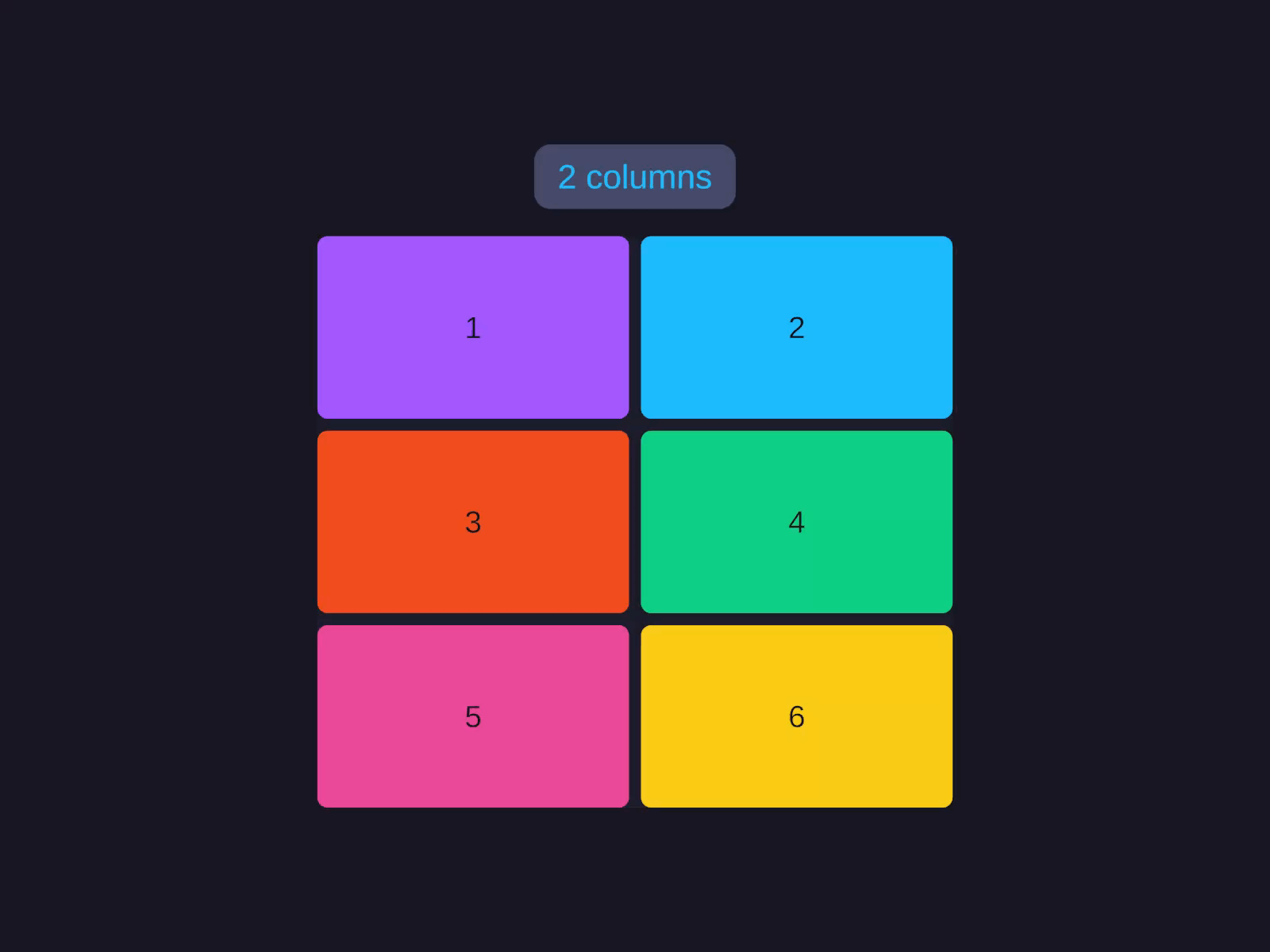
Instead of a count, you can specify per-track sizes as a string template — just like CSS Grid. Tracks can be pixels, fractions (1f, 2f), percentages, content-sized (auto), or responsive (repeat(auto-fit, …)).
Template tracks
Size each column and row independently with a CSS-style string template — fixed pixels, fractions, percentages, or content-sized.
| Token | Meaning |
|---|---|
200 | Fixed pixels |
1f, 2f | Fractional unit (shares remaining space proportionally) |
25% | Percentage of container |
auto | Sized to content (intrinsic) |
repeat(3, 1f) | 1f 1f 1f — counted repeat |
repeat(3, 100 1f) | 100 1f 100 1f 100 1f — multi-track repeat |
repeat(auto-fit, minmax(200, 1f)) | Responsive: as many columns as fit, each ≥ 200px |
Auto-fit columns
The most-used responsive pattern. Column count changes with container width.
Auto-fit columns
Fit as many equal columns as the container width allows, each at least a minimum size — the column count reflows as the container resizes.
A percentage minimum works too — write repeat(auto-fit, minmax(25%, 1f)) for at most four columns, each at least 25% of the container.
Horizontal align
How items sit horizontally in their cells (container default for every cell).
| Value | Effect |
|---|---|
Stretch (default) | Items fill the full track width |
Start | Pin to the left of the cell |
Center | Center horizontally in the cell |
End | Pin to the right of the cell |
Cell alignment
Control how items sit inside their cells on both axes — stretch to fill, or pin to start, center, or end.
Override per item with the Grid item Horizontal Align Override.
Vertical align
How items sit vertically in their cells. Same four values as Horizontal Align, applied to the row direction.
Override per item with the Grid item Vertical Align Override.
Flow
How items fill empty cells when not explicitly placed via the Grid item Column / Row.
| Value | Effect |
|---|---|
Row (default) | Fill row by row, left to right |
Column | Fill column by column, top to bottom |
Dense | Row-major packing that backfills earlier holes left by spanning items (items may appear out of source order). Like CSS grid-auto-flow: row dense |
Masonry | Items drop into the shortest column; no row tracks — they stack vertically with RowGap. Row templates/RowSpan/vertical align are ignored |
MasonryRow | Items drop into the shortest row; no column tracks — they stack horizontally with ColumnGap. Column templates/ColumnSpan/horizontal align are ignored |
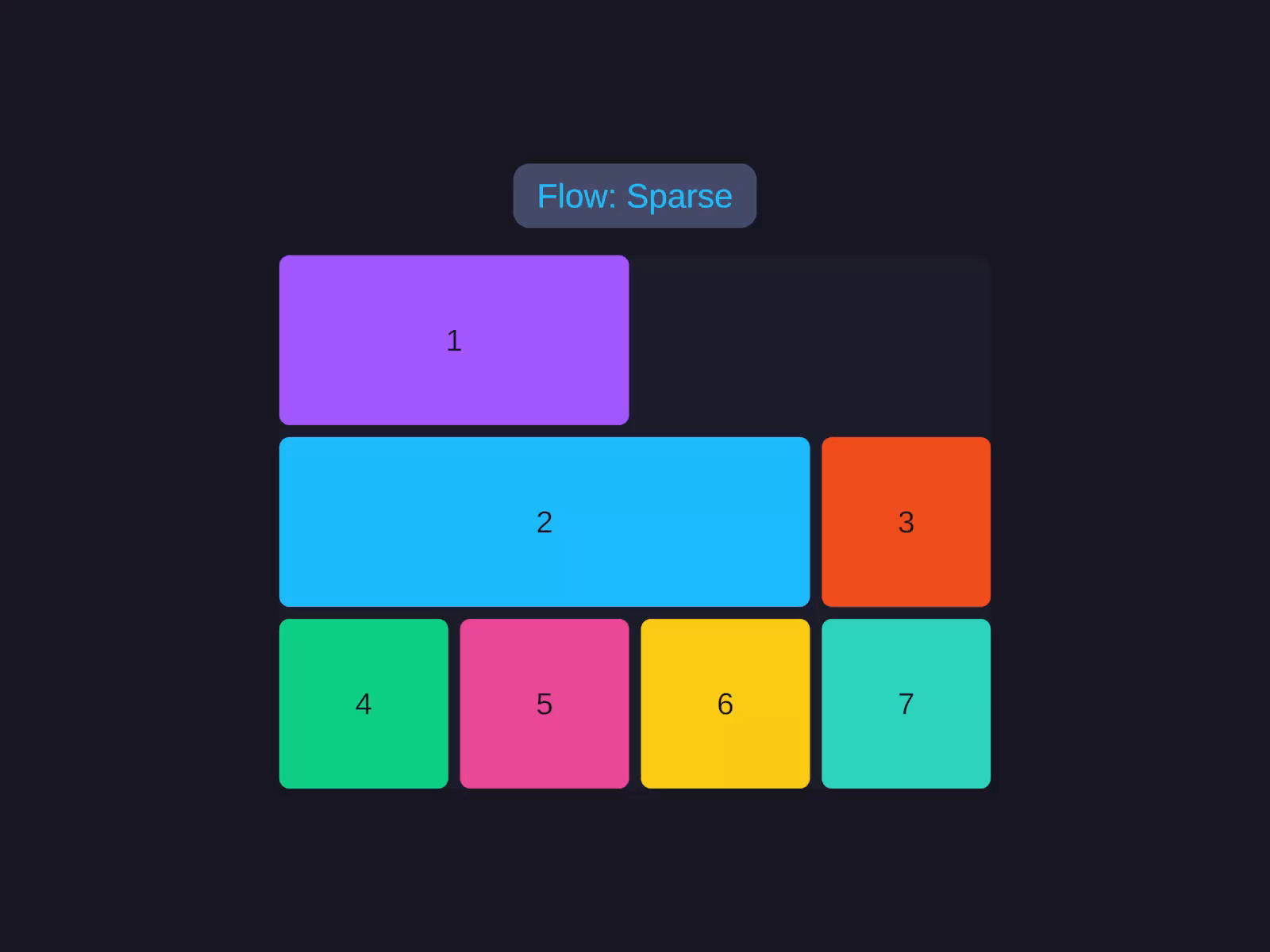
Flow & dense packing
Choose how unplaced items fill the grid — row by row, column by column, or with dense backfilling that closes gaps left by spanning items.
Dense flow is useful when items have spans (see Grid item) and would otherwise leave gaps.
Column gap and row gap
Spacing between cells. Independent per axis.
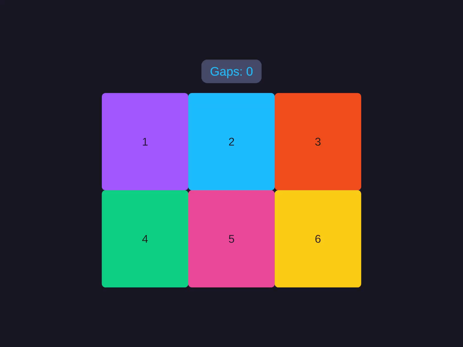
Gap is shorthand for setting both Column Gap and Row Gap at once.
Padding on a Grid container works the same as on Row/Column — it’s the inset between the grid bounds and the cell area. See Padding.
Grid item
Per-item properties that control cell placement, spans, and alignment overrides — set on the child, not the Grid container.
Column / Row
Explicit placement. Negative = auto-place.
Item placement & spans
Pin a child to an explicit cell and let it span multiple tracks — per-item properties on the grid's children.
If Column or Row is negative (the inspector default), the grid’s auto-flow places the item — see Flow.
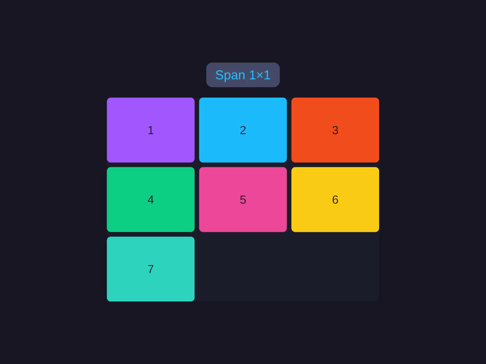
Column span / Row span
How many tracks the item occupies. Default 1. Set Column Span to make a child span multiple columns, or Row Span to span multiple rows.
Combine spans with Flow.Dense to backfill gaps.
Horizontal Align Override / Vertical Align Override
Per-item override of the grid’s container-level alignment. Defaults to Auto (inherit from parent). Set a single child’s Horizontal Align Override or Vertical Align Override to pin just that cell while the rest follow the container default.
GridAlignment values: Auto · Stretch · Start · Center · End.
Common patterns
Photo gallery (responsive)
A Grid container with Width Fill and Column Sizes repeat(auto-fit, minmax(160, 1f)), where each cell child uses an aspect-ratio height for square tiles. See the Code API for the builder version.
Sidebar + content + inspector
A Grid container filling both axes with Column Sizes 200 1f 240 (fixed sidebar, flexible content, fixed inspector) and a single 1f row. See the Code API for the builder version.
Form (label / field rows)
A Grid container with Column Sizes auto 1f — the auto track sizes to the widest label and the 1f track fills the remaining width for each field input. See the Code API for the builder version.
Related
- Sizing — track sizing units explained
- Row & Column — for simpler 1D layouts
- GridView — virtualised grid for large datasets
- AutoUI — builder reference