AutoLayout Overview
AutoLayout is the single component you add to a UI GameObject to drive its sizing and positioning. It replaces Unity’s LayoutGroup + ContentSizeFitter + LayoutElement stack — or coexists with it, so you can adopt it screen by screen.
Its Inspector has three sections: Size & Position (the element itself), Child Layout (how it arranges its children), and Transitions (animating changes). Here’s every line.
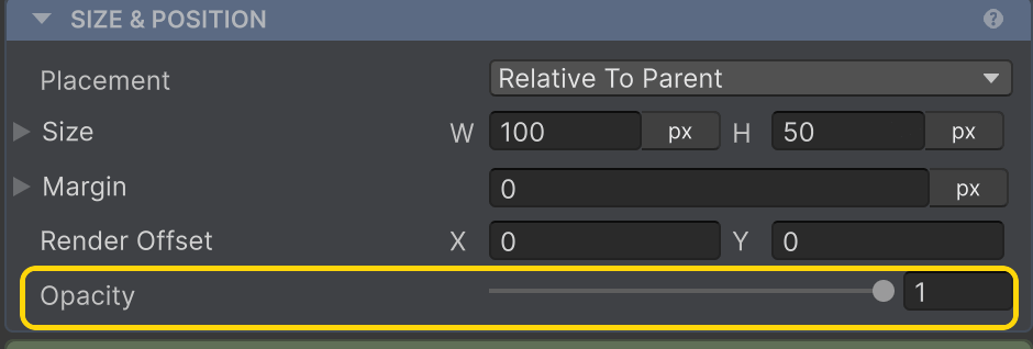
Size & Position
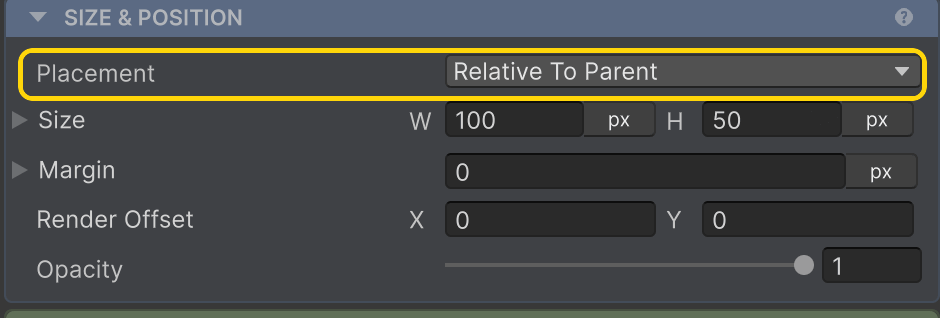
Placement
How this element sits in its parent — Relative To Parent (in flow), Absolute, Cover Parent, Ignored, or Collapsed (out of flow). docs →
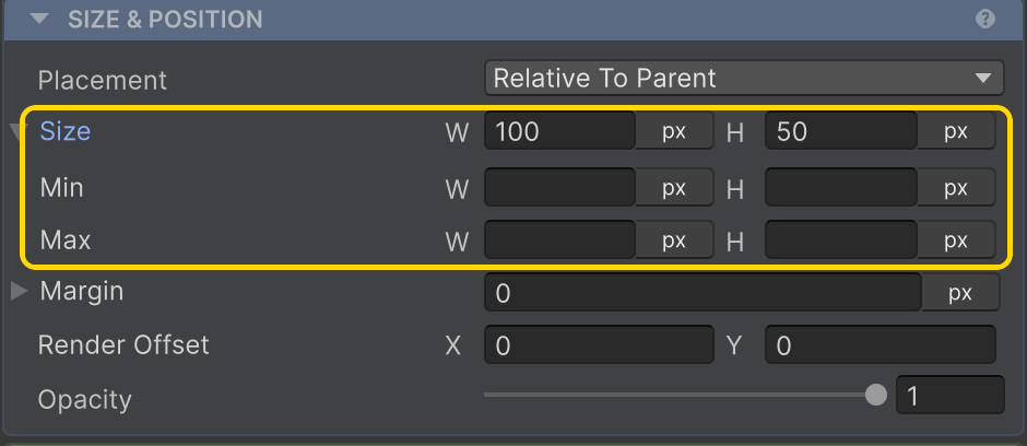
Size
Each axis picks a unit — Pixels, Hug, Fill, Percentage, AspectRatio, or TextSize — with optional Min/Max clamps. docs →
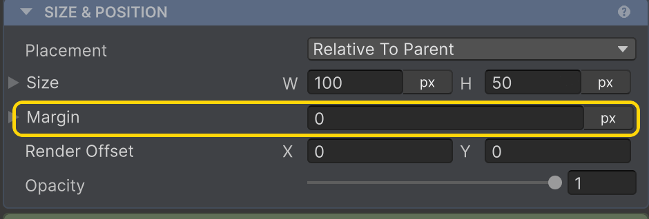
Margin
Outset that pushes siblings away — separate from the parent's Gap. docs →
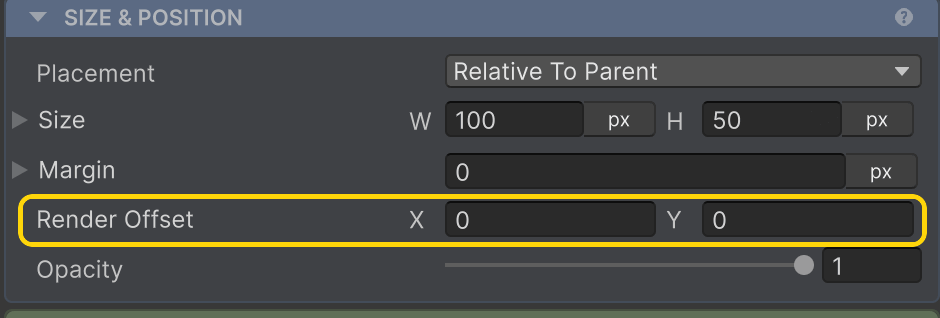
Render Offset
Visual-only nudge applied after layout, for hover / shake / bounce that doesn't reflow siblings. docs →
Opacity
Fades the element (0–1) via a CanvasGroup AutoLayout manages for you; it still takes space. To drop it from flow, set Placement → Collapsed. docs →
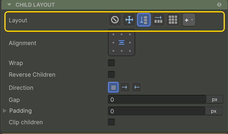
Child Layout
Layout and Clip children are always shown. Everything between them depends on the Layout you pick.
Layout
The arrangement engine: None, Absolute, Row, Column, Grid, or a Custom layout (the + button). docs →
None & Absolute
Neither arranges children — they keep their own anchors/offsets. The section collapses to just Layout and Clip children. docs →
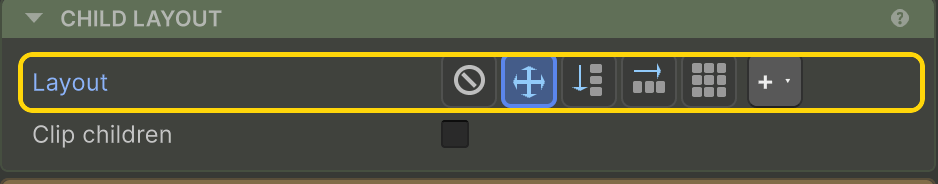
Clip children
Masks children to this element's bounds (adds a RectMask2D). Cosmetic — it doesn't change layout. docs →
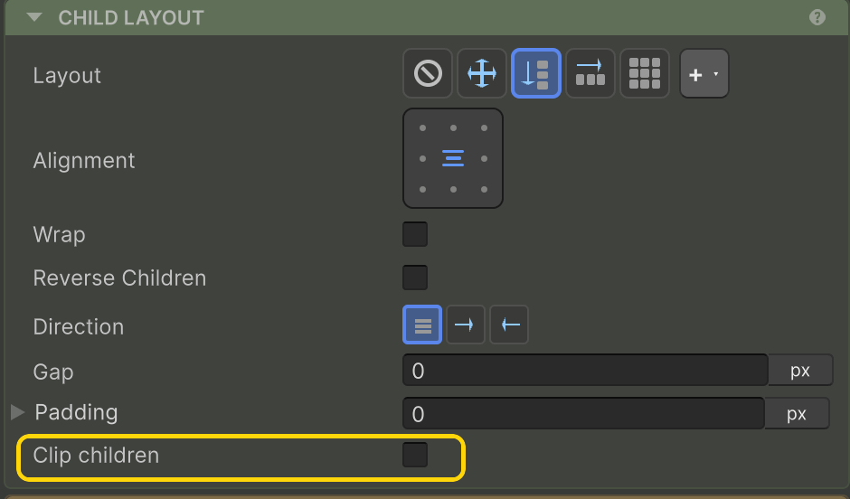
Row / Column
Pick Row or Column and these flow controls appear.
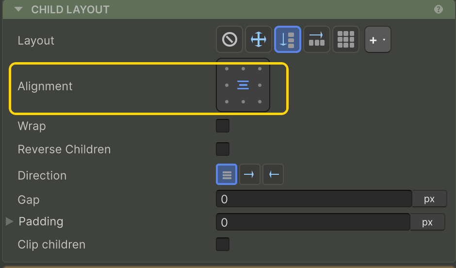
Alignment
The grid sets main- and cross-axis alignment (Start / Center / End / Stretch) in one click. docs →
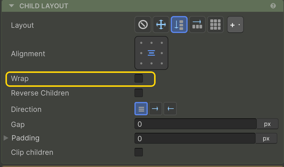
Wrap
Lets children spill onto new lines when they run out of room on the main axis. docs →
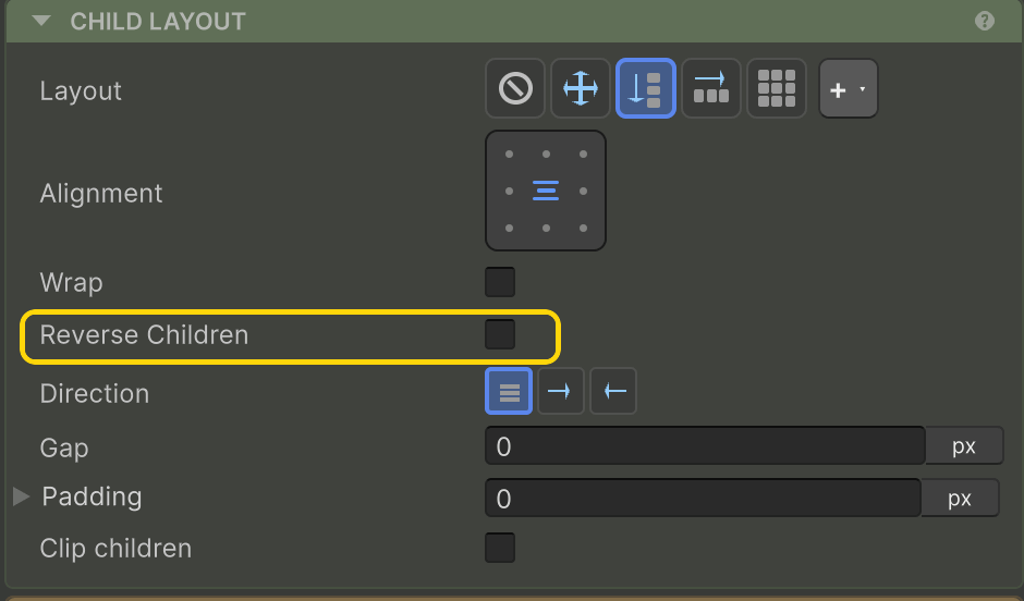
Reverse Children
Flips child order — the last renders first — without changing alignment. docs →
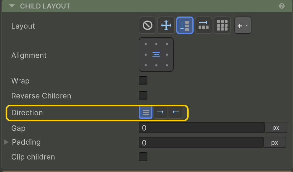
Direction
Left-to-right, right-to-left, or inherit — flips the flow and remaps Start for RTL languages. docs →
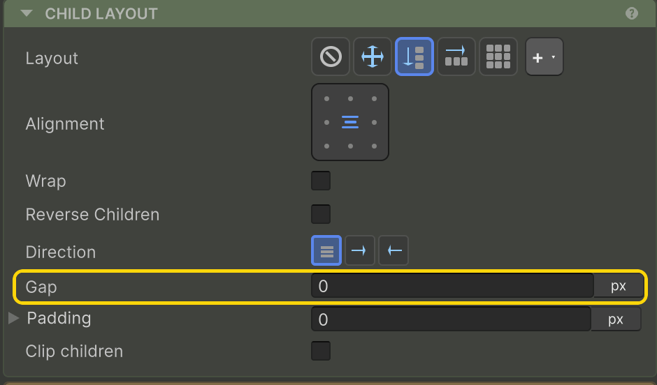
Gap
Even spacing between children. Type a pixel value, or auto / around / even for distributed spacing. docs →
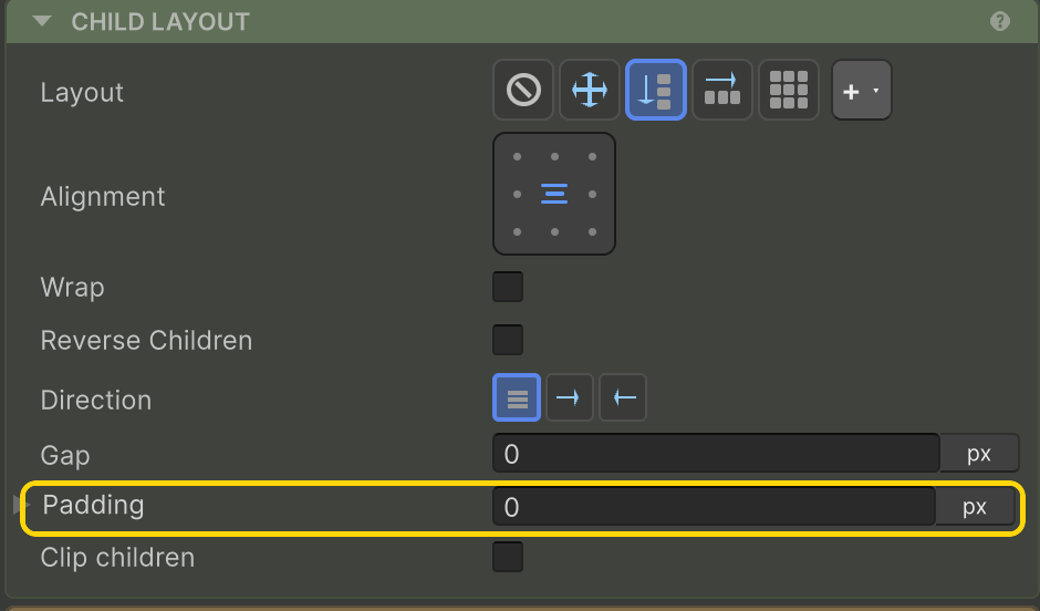
Padding
Insets children from this element's edges. docs →
On each child — Cross Align Override
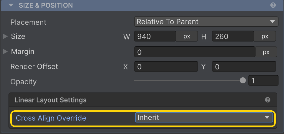
Cross Align Override
A child can override the row/column's cross-axis alignment just for itself; default is Inherit. docs →
Grid
Pick Grid and the 2-D controls appear.
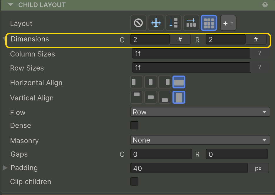
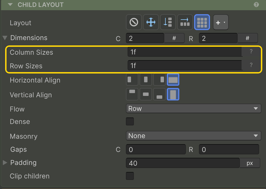
Dimensions
Column and row counts. Leave a count on auto to derive it from the track template. docs →
Column / Row Sizes
Track templates — e.g. 200 1f 1f or repeat(auto-fit, minmax(200, 1f)). Tokens: px, fr, %, auto. docs →
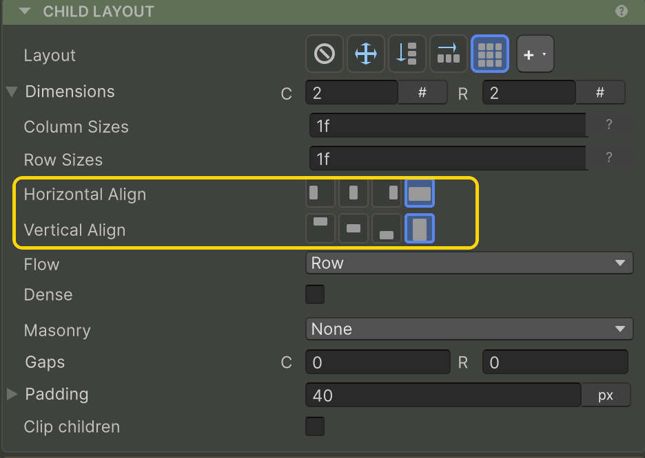
Horizontal / Vertical Align
How items sit inside their cells — Stretch, Start, Center, or End, per axis. docs →
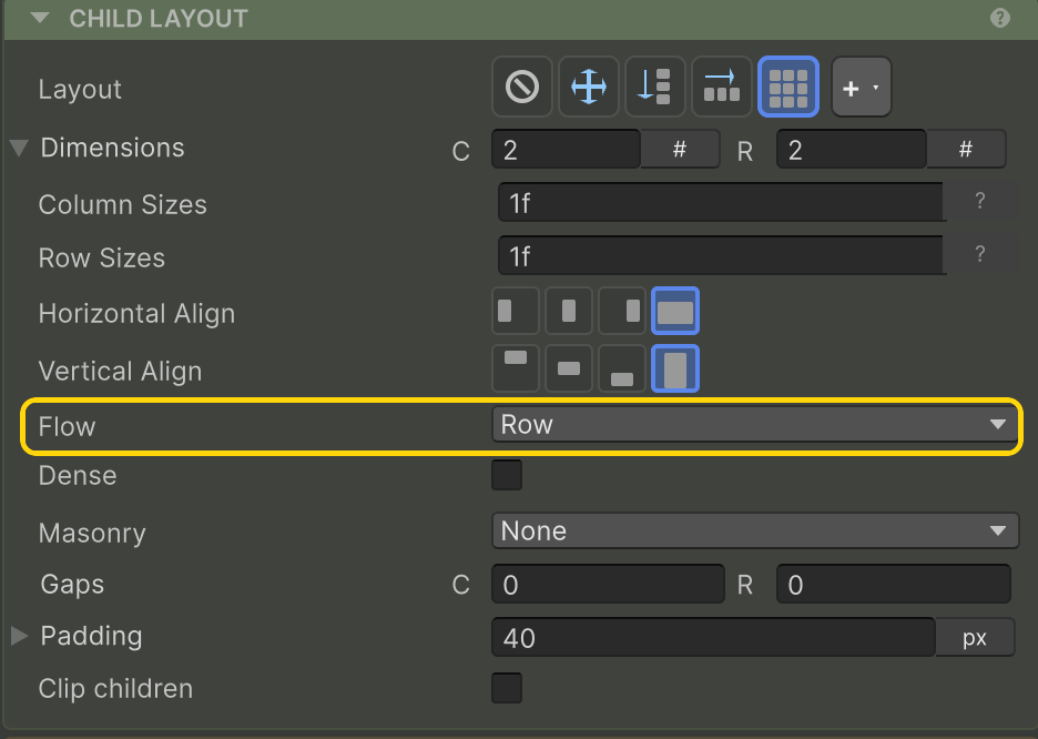
Flow
Fill order for auto-placed items — by Row or by Column. docs →
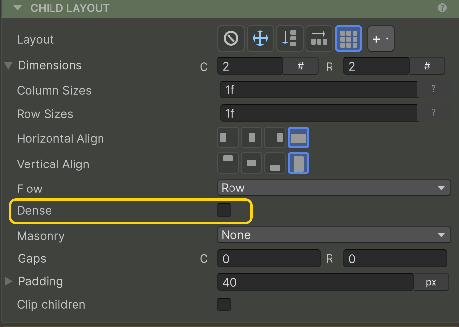
Dense
Backfills gaps left by spanning items; items may render out of source order. docs →
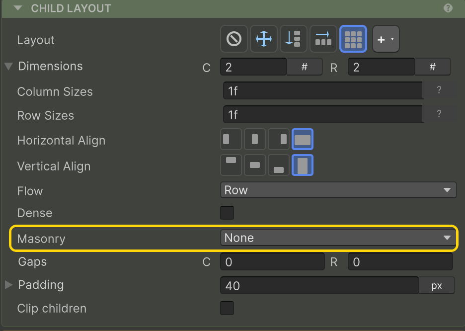
Masonry
Items drop into the shortest column (or row) instead of aligned tracks. docs →
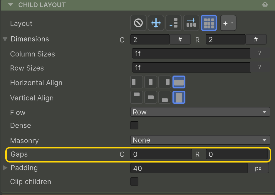
Gaps
Column and row spacing between cells, set independently. docs →
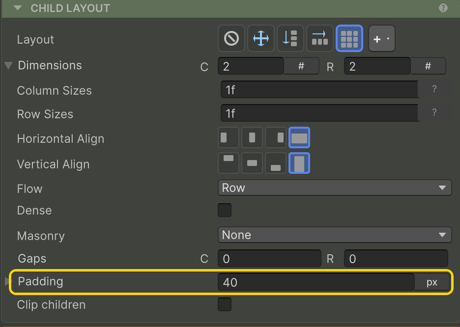
Padding
Insets the whole grid from this element's edges. docs →
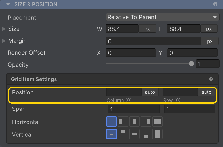
On each child — Grid item
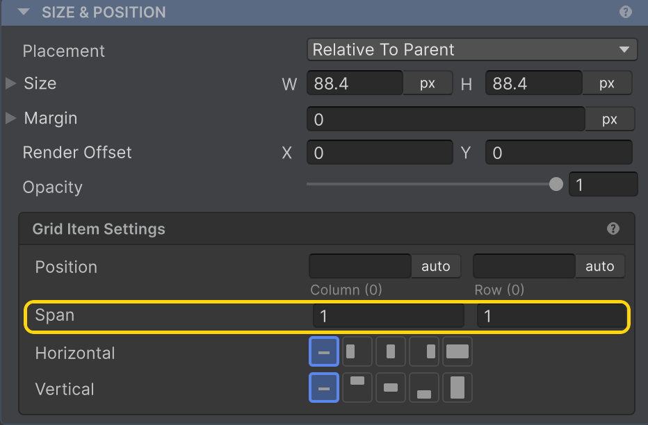
Position
Pins the item to an explicit Column/Row, or auto to let the grid place it. docs →
Span
How many columns and rows the item covers. docs →
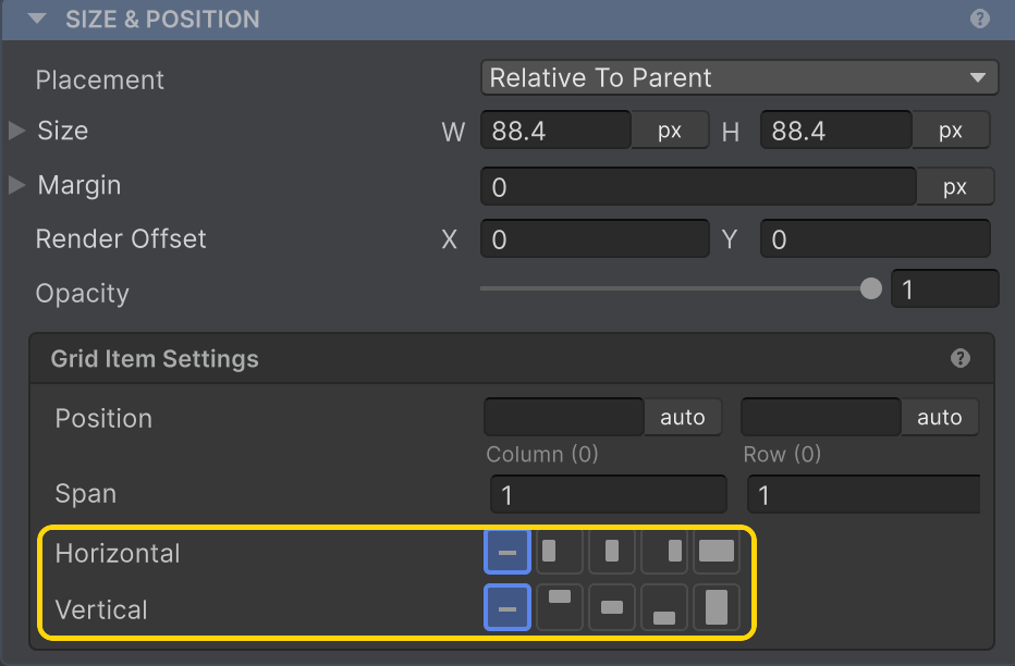
Horizontal / Vertical Align
Per-item override of the grid's cell alignment. docs →
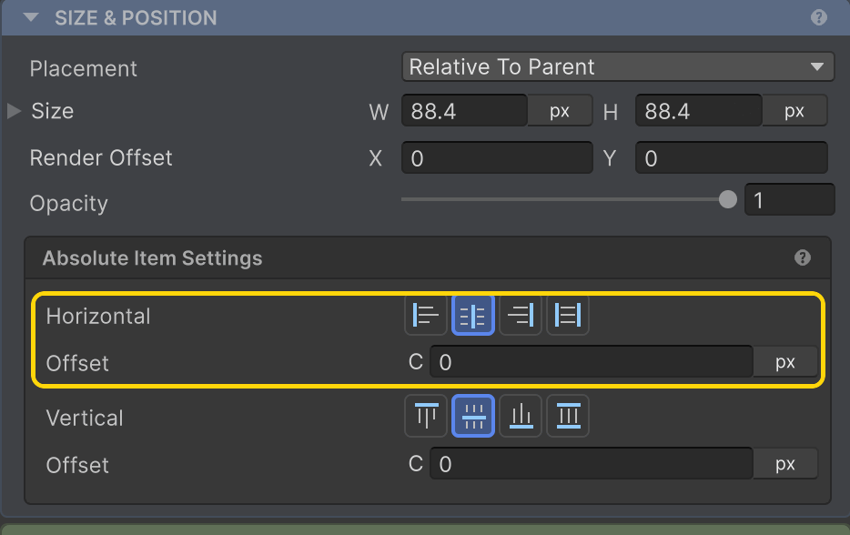
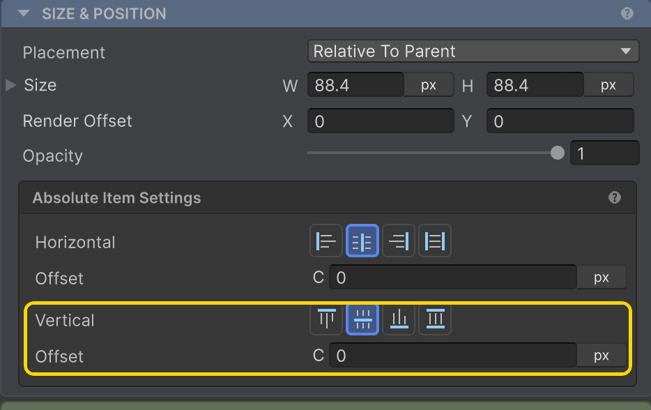
Absolute
Absolute layout has no container options — the positioning lives on each absolute child.
Horizontal + Offset
Pin to one edge (Left / Center / Right) or stretch between both, with a pixel offset. docs →
Vertical + Offset
Pin to Top / Center / Bottom or stretch between both, with a pixel offset. docs →
Transitions
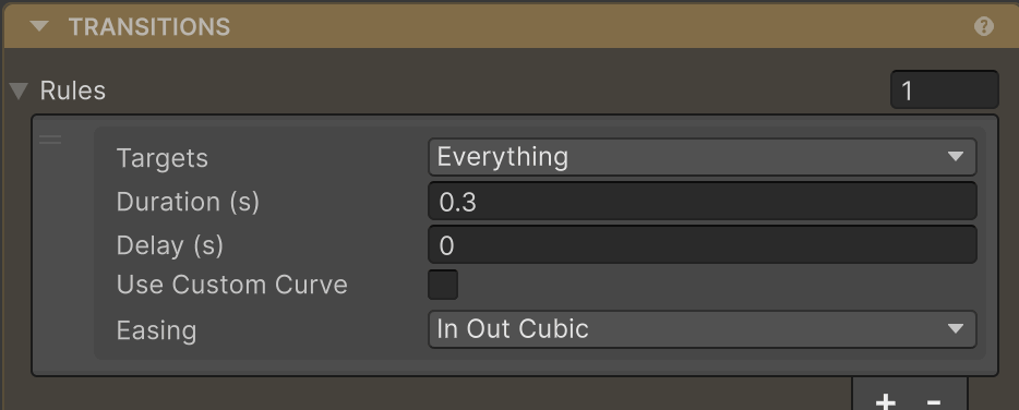
Rules
Add rules to animate property changes — set Targets, Duration, Delay, and Easing. docs →
Related
- Sizing · Margin · Render Offset — SIZE & POSITION
- Layout Type · Row & Column · Grid · Padding · Absolute · Clipping — CHILD LAYOUT
- Transitions · Custom Layouts · AutoUI — the code-first builder