Progress Bar
Linear or radial progress indicator with customizable colors and optional label.
Modes
Linear progress (horizontal/vertical)
Mode = ProgressBarMode.Linear fills a bar along the axis set by FillDirection — LeftToRight, RightToLeft, TopToBottom, or BottomToTop. The bar takes whatever Width/Height you set on the parent.
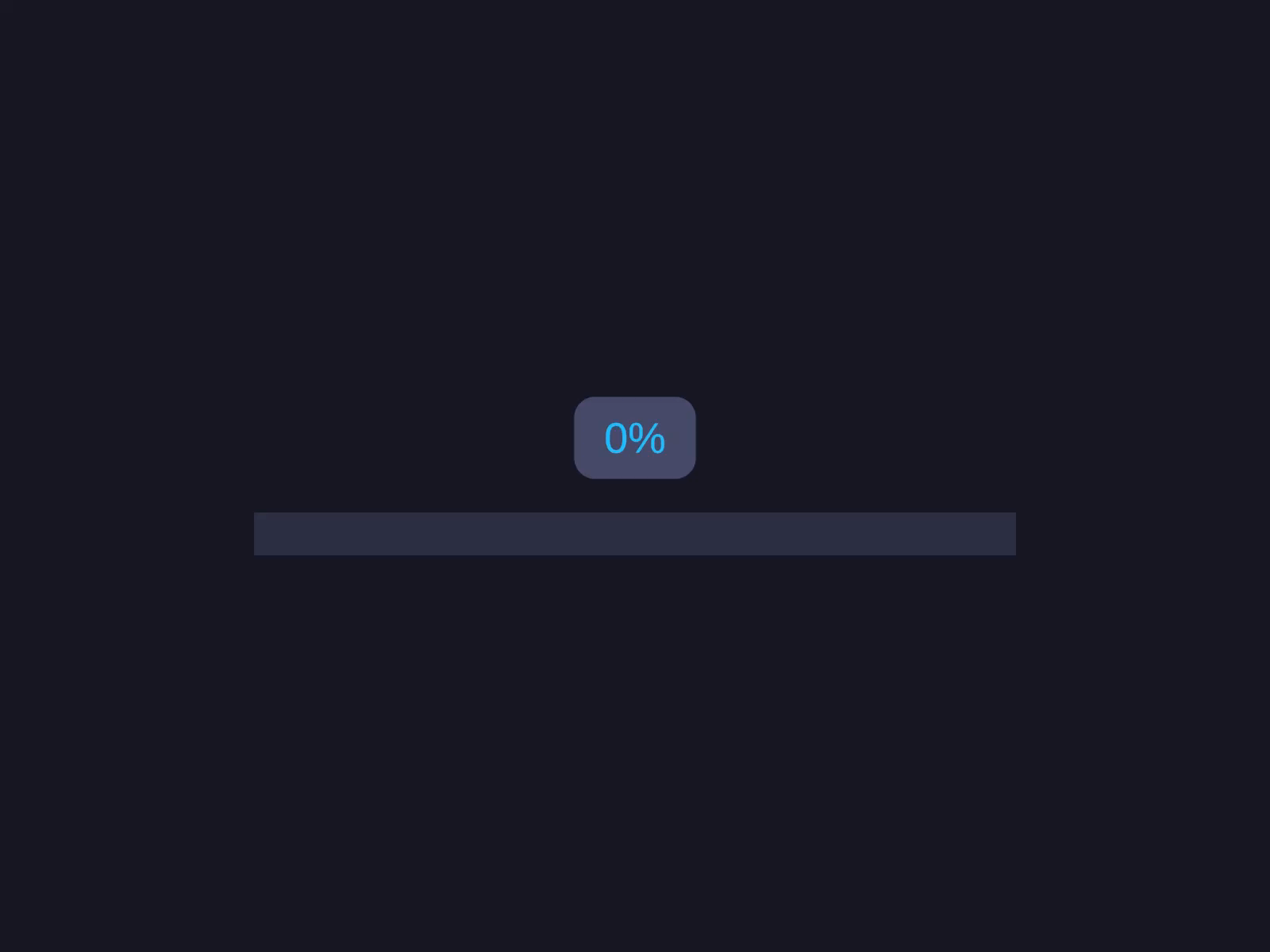
Linear progress (horizontal/vertical)
Linear mode fills a bar along the axis set by FillDirection — horizontal or vertical.
Radial progress (circular arc)
Mode = ProgressBarMode.Radial renders a circular arc. Control it with StartAngle, Clockwise, and ArcRange (360 = full circle).
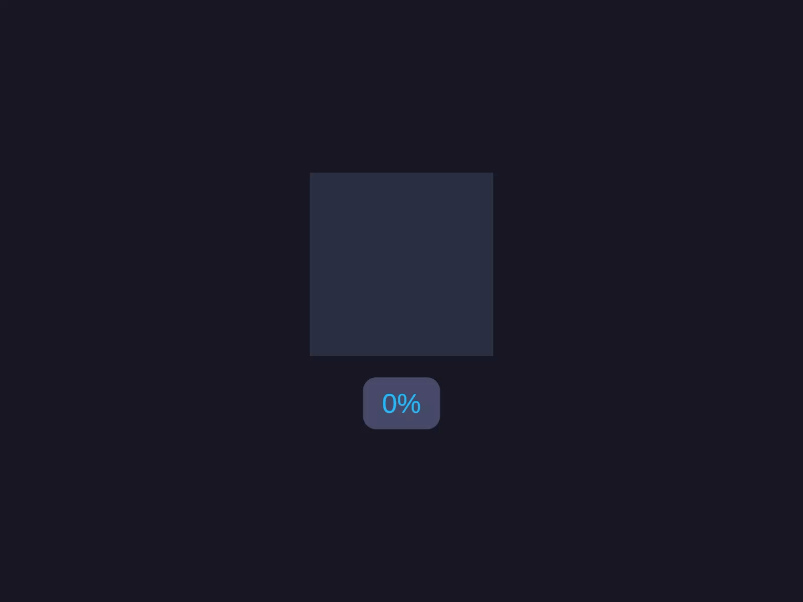
Radial progress (circular arc)
Radial mode renders a circular arc controlled by StartAngle, Clockwise, and ArcRange.
On the AutoLayout Progress Bar component, set Mode to Radial. Set Start Angle to 90, enable Clockwise, set Arc Range to 360, and Value to 0.75.
var bar = go.GetComponent<AutoLayoutProgressBar>();bar.Mode = ProgressBarMode.Radial;bar.StartAngle = 90f;bar.Clockwise = true;bar.ArcRange = 360f;bar.Value = 0.75f;bar.RebuildVisuals();Inspector Setup
- Add AutoLayout Progress Bar to a GameObject with
AutoLayout. - Choose Linear or Radial mode.
- Set the initial value and customize colors.
| Field | Type | Default | Description |
|---|---|---|---|
| Mode | ProgressBarMode | Linear | Linear or Radial |
| Value | float | 0 | Progress value (0-1) |
| Track Color | Color | Dark gray | Background track color |
| Fill Color | Color | Light blue | Progress fill color |
| Show Label | bool | false | Display percentage label |
| Label Format | string | "{0:0%}" | Label format string |
Linear Mode
| Field | Type | Default | Description |
|---|---|---|---|
| Fill Direction | LinearFillDirection | LeftToRight | Fill direction |
Radial Mode
| Field | Type | Default | Description |
|---|---|---|---|
| Start Angle | float | 90 | Arc start angle (0-360) |
| Clockwise | bool | true | Fill direction |
| Arc Range | float | 360 | Total arc range (0-360) |
Code Usage
Build it in the Inspector (see Inspector Setup above), or from code with the Code API.
Runtime Updates
// Update value (fires OnValueChanged)m_LinearBar.Value = 0.8f;
// Change colorsm_LinearBar.FillColor = Color.red;m_LinearBar.TrackColor = Color.black;
// Toggle labelm_LinearBar.ShowLabel = true;
// Rebuild visuals (e.g., after switching mode)m_LinearBar.Mode = ProgressBarMode.Radial;m_LinearBar.RebuildVisuals();
Methods
| Method | Description |
|---|---|
RebuildVisuals() | Destroy and recreate children based on current mode |
Properties
| Property | Type | Description |
|---|---|---|
Value | float | Progress (0-1), clamped |
Mode | ProgressBarMode | Linear or Radial |
TrackColor | Color | Background track color |
FillColor | Color | Fill color |
ShowLabel | bool | Show/hide percentage label |
LabelFormat | string | Label format string |
FillDirection | LinearFillDirection | Linear fill direction |
StartAngle | float | Radial start angle |
Clockwise | bool | Radial fill direction |
ArcRange | float | Radial arc range |
Events
| Event | Signature | Description |
|---|---|---|
OnValueChanged | Action<float> | Fires when Value changes |
Builder API
| Method | Description |
|---|---|
.Value(float) | Set initial value (0-1) |
.FillColor(Color) | Set fill color |
.TrackColor(Color) | Set track color |
.ShowLabel() | Enable percentage label |
.LabelFormat(string) | Set label format |
.FillDirection(LinearFillDirection) | Set linear fill direction |
.StartAngle(float) | Set radial start angle |
.Clockwise(bool) | Set radial direction |
.ArcRange(float) | Set radial arc range |
.Capture(Action<AutoLayoutProgressBar>) | Capture reference |
Notes
- The bar takes whatever Width/Height you set on the parent. There are no auto-defaults — set sizing explicitly before the
.ProgressBar(...)call. - Label uses zero-GC
SetText("{0}", value * 100f)internally. - Linear mode uses
Image.Type.Filledwith Horizontal/Vertical fill method. - Radial mode uses
Image.Type.Filledwith Radial360 fill method. - Changing
Modeat runtime requires callingRebuildVisuals().