Absolute Positioning & Placement
For everything that doesn’t flow with Row/Column/Grid: badges, overlays, popovers, backgrounds, and per-side anchored panels. AutoLayout handles these via two related concepts:
- Placement — how this element relates to its parent’s layout flow.
- Absolute axis constraints — for
Placement.Absolute, where exactly it sits (Top/Bottom/Left/Right edge offsets).
Placement modes
Set via .Absolute(), .Cover(), .Ignored(), or .Layout(LayoutType.X) on the parent.
| Mode | Behaviour | Use it for |
|---|---|---|
| Relative To Parent (default) | Participates in parent’s Row/Column/Grid flow | Most children |
| Absolute | Sized normally, positioned relative to parent’s content rect via Top/Bottom/Left/Right | Badges, popovers, anchored UI |
| CoverParent | Stretches to match parent’s full bounds (ignores parent’s padding) | Backgrounds, overlays, modal scrims |
| Ignored | Sized by AutoLayout, positioned externally | ListView/GridView pooled items (don’t use directly) |
| Collapsed | Removed from layout entirely (stays in the hierarchy) | Hiding an element without disabling the GameObject |
The container’s LayoutType is separate — see Layout Type.
Absolute children — the four constraints
When a child has Placement.Absolute, you anchor it to one or two edges per axis.
Single-edge anchor
Single-edge anchor
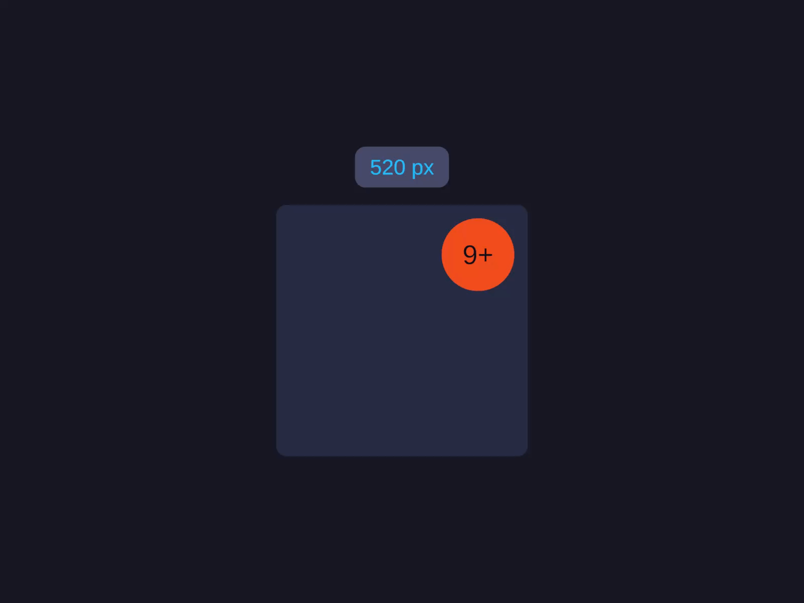
Sized normally, positioned relative to parent's content rect via Top/Bottom/Left/Right — a floating panel pinned to a corner.
On the child, set Placement to Absolute. The Absolute Position edge fields then appear — anchor one edge (e.g. top and right) to pin the element to a corner.
layout.Placement = Placement.Absolute;layout.VerticalConstraint = AxisConstraint.Start(20f); // 20px from toplayout.HorizontalConstraint = AxisConstraint.End(20f); // 20px from rightEach Top/Bottom/Left/Right takes a UIPosition:
UIPosition.Pixels(20) // 20px offsetUIPosition.Percentage(10) // 10% of parent's axisUIPosition.None() // no constraint on this side (use opposite anchor)Stretch (two-edge anchor)
To stretch an absolute element across an axis, anchor both edges via LeftRight or TopBottom:
Stretch (two-edge anchor)
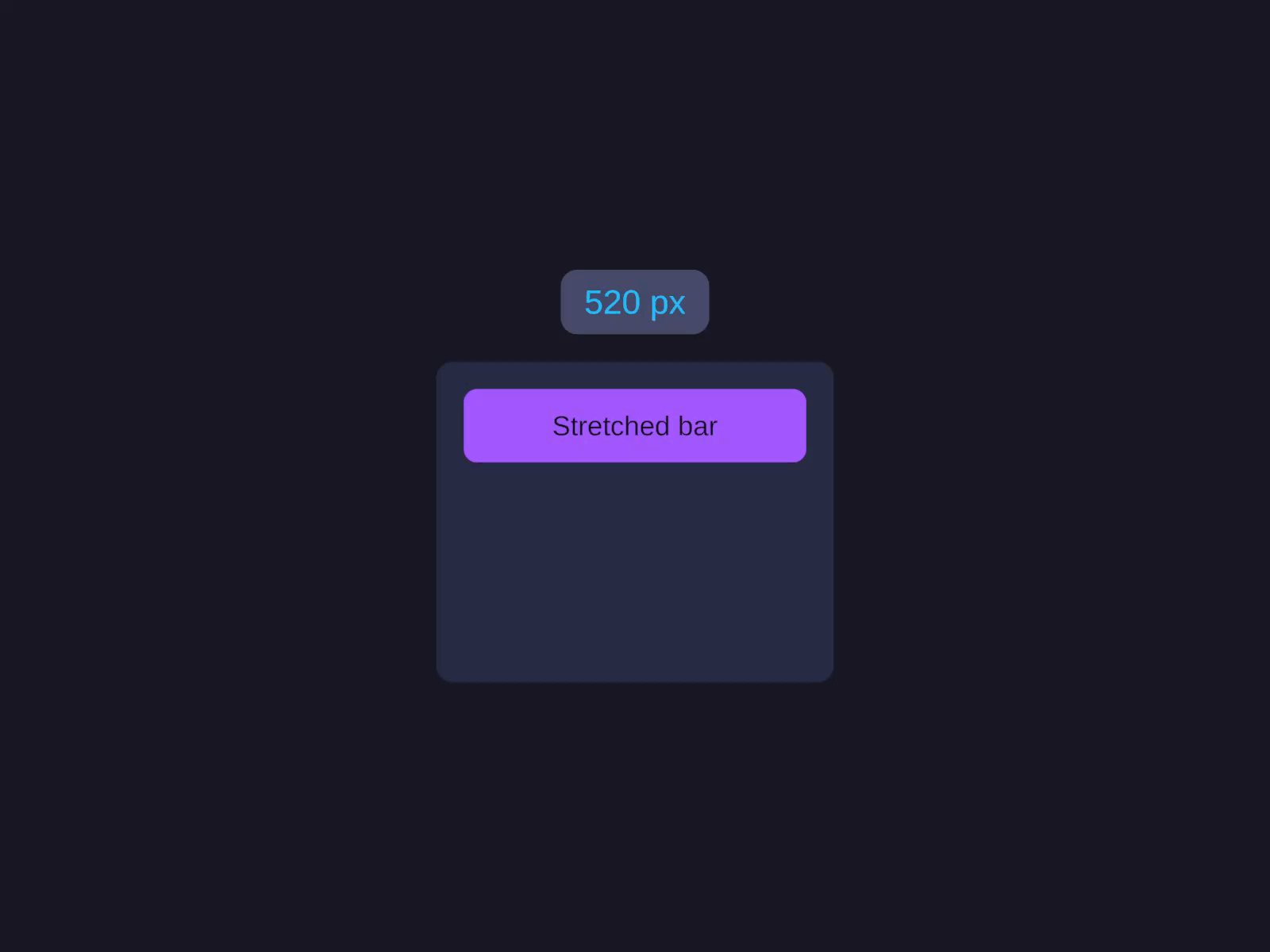
Anchor both edges so the element grows to fill the space between the two offsets — its Width/Height is ignored on that axis.
Set Placement to Absolute, then in Absolute Position anchor two opposite edges (e.g. left and right) so the element stretches between the two offsets. Its size on that axis is ignored.
layout.Placement = Placement.Absolute;layout.HorizontalConstraint = AxisConstraint.Stretch(16f, 16f); // 16px in from both sideslayout.VerticalConstraint = AxisConstraint.Start(0f); // pinned to topLeftRight and TopBottom set the anchor to Stretch so the element grows to fill the space between the two offsets — its Width/Height is ignored on that axis.
Combinations
| Want | Constraint setup |
|---|---|
| Pinned to top-left corner | .Top(...) + .Left(...) (Width/Height from sizing) |
| Pinned to bottom-right | .Bottom(...) + .Right(...) |
| Stretched horizontally, pinned to top | .LeftRight(a, b) + .Top(...) |
| Stretched both axes (= Cover with margin) | .LeftRight(a, b) + .TopBottom(c, d) |
| Centered horizontally | .Width(X) + don’t set .Left/.Right (positions at center by default), or compute via percentages |
CoverParent — the simplest overlay
When you just want “fill my parent completely,” use .Cover():
CoverParent overlay
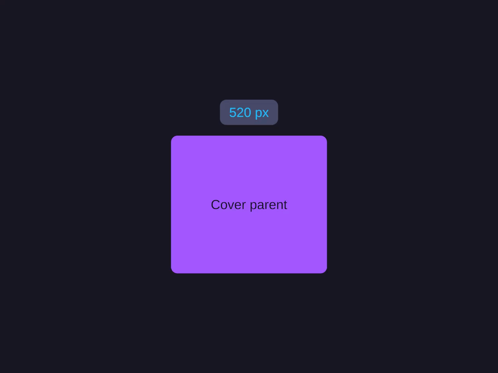
Stretches to match the parent's full bounds, ignoring padding — ideal for full-bleed backgrounds and modal scrims.
Cover() ignores the parent’s padding. Useful for full-bleed backgrounds and modal scrims that should darken the entire parent including its padded region.
Ignored placement
.Ignored() tells AutoLayout: “size this element, but I’ll position it myself externally.” This is what ListView and GridView use for pooled items — they reuse the same item GameObjects across many positions, AutoLayout sizes them, and the View moves them around manually.
Don’t use this directly unless you’re writing a virtualised list/grid.
Order and Visibility
Two related properties for “this child exists but I want to control its visibility/order” — set Order to render a child before or after its hierarchy siblings, and Visibility to draw, hide, or collapse it.
| Property | Values | Behaviour |
|---|---|---|
Order(int) | any int (default 0) | Override visual order. Lower = earlier. |
Visibility(...) / Hidden() / Collapsed() | Visible / Hidden / Collapsed | Visible: normal. Hidden: invisible but takes layout space. Collapsed: removed from layout entirely. |
Hidden is useful for tabs/panels you want to keep mounted but not draw. Collapsed is for fully removing an element without re-layout cost on the next show.
Common patterns
Badge in the corner of a card
A Hug-sized card (Column layout) with a small badge child whose Placement is Absolute, anchored to the top and right edges with negative offsets so it sticks out past the card’s corner. See the Code API for the builder version.
Modal scrim with centered card
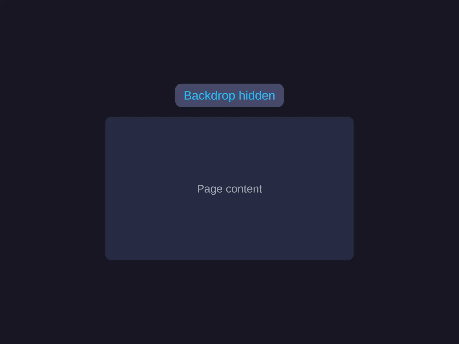
Modal pattern (centered + backdrop)
A full-bleed dark backdrop plus a centered card — the canonical modal/dialog layout.
Give the backdrop Placement = Cover for the full-bleed scrim. Center the card by setting its parent’s Alignment to center on both axes.
backdrop.Placement = Placement.CoverParent; // full-bleed dark scrimcard.MainAxisAlign = Alignment.Center; // center the card in its parentcard.CrossAxisAlign = Alignment.Center;Overlapping sticky footer
A fill-sized container holding a scrolling body, plus a Hug-height footer child whose Placement is Absolute, stretched across the bottom edge (left and right both anchored, pinned to the bottom) so it floats over the scroll content. See the Code API for the builder version.
Related
- Layout Type —
LayoutType.Absoluteon the container makes every child default to absolute - Sizing — how Width/Height interact with absolute constraints
- AutoUI — builder reference